
Being stuck at home over Easter should have left more time for electricity market-gazing, but the times being what they are other priorities have kept me away until now from looking at a number of events on Easter Saturday (11 April 2020) that have drawn comment in a few different corners of the energy-news-and-social-media-sphere. In this post I’ll aim to cover some of them without falling totally down any rabbit-holes.
Renewables hit a new high
Hugh Saddler was quick to note that for a couple of hours in the middle of the day, just over 50% of consumption in the NEM was being supplied from renewable sources, large and small:
 Digging out AEMO’s half hourly data for NEM-wide generation, including estimated small scale Rooftop PV production, we can quickly see why this was the case:
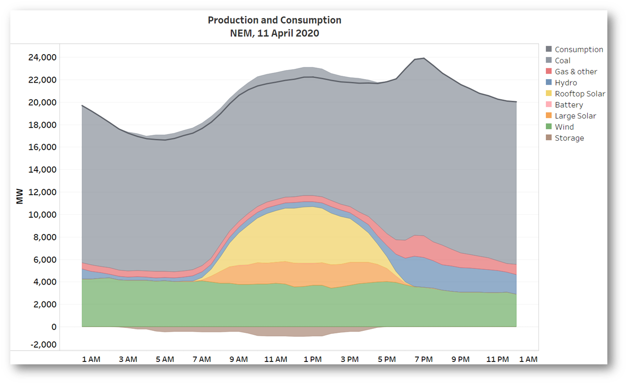
Strong steady winds in the south east saw around 3.5-4GW of wind generation throughout the day, and with around 7GW of peak solar output (some 5GW of that from small scale Rooftop PV) plus a small amount of hydro, we see half hourly renewables output peaking at around 11GW versus consumption of 22GW. Even so it’s still worth observing that coal and gas supplied two-thirds of the total energy consumed across the day – the energy transition is happening, and accelerating, but it has a way to run yet.
A quick side-note on “Consumption” – this is shorthand for demand that AEMO sees being supplied from large scale generation on the grid (known officially as Operational Demand), plus estimated production from rooftop PV, which meets demand that the grid would otherwise have to supply. That quick description glides over a lot of wrinkles in demand measurement that some of Paul McArdle’s articles and explainers dwell on. I’ve also excluded from “Consumption” energy that was supplied into grid-scale storage – primarily the Wivenhoe, Tumut 3, and Shoalhaven pumped hydro schemes – as the chart shows, they were taking advantage of plentiful supply and low spot prices to maximise their pumping across the middle of the day.
Just as confirmation of the 50% benchmark, here is the same production data shown as percentages of Consumption:
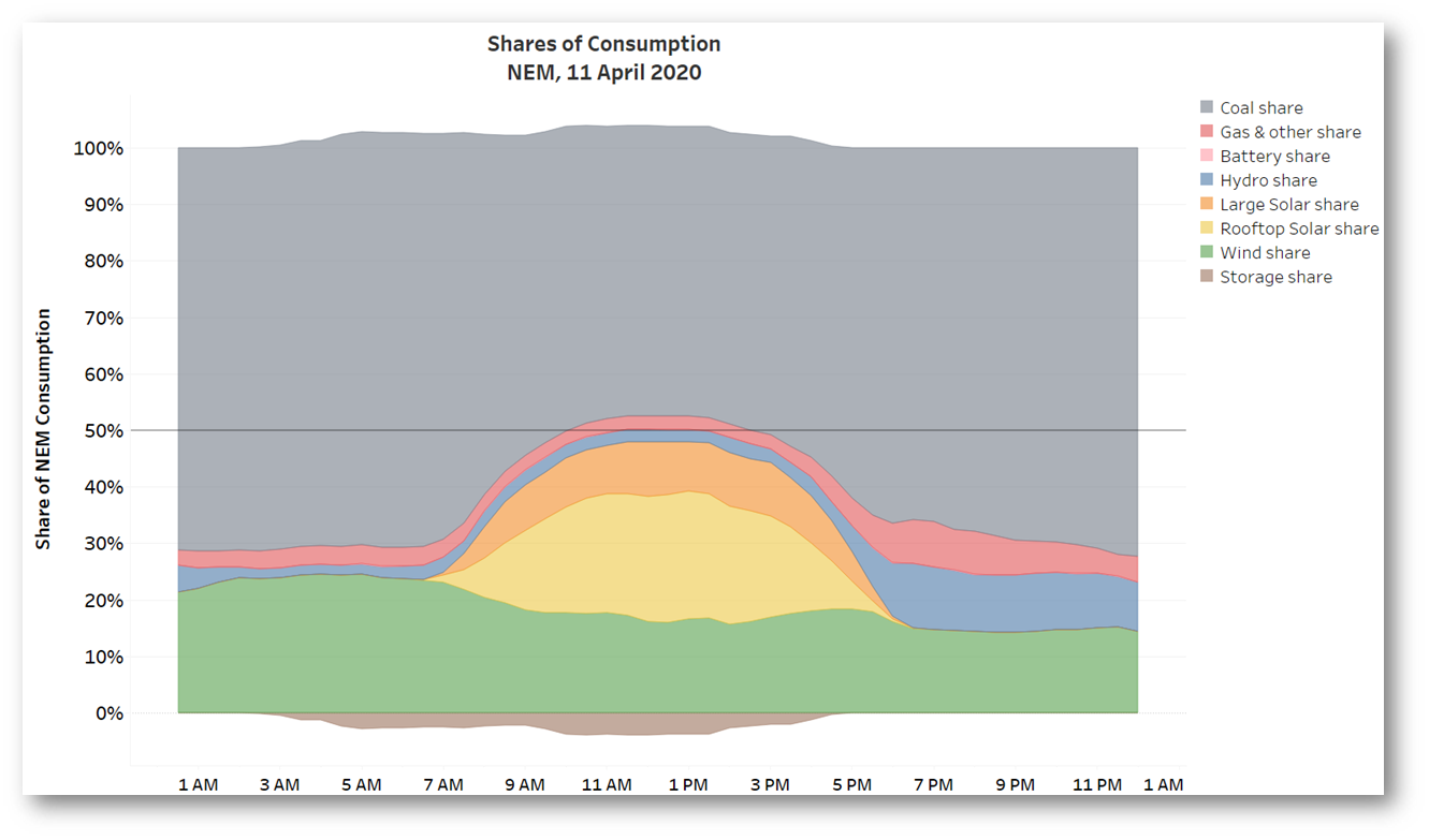 The top of the renewable production stack (wind, solar & hydro) is indeed sitting right on that 50% line for four half-hours, as advertised.
Did COVID-19 suppress demand and bump up the renewable share?
We could ask, especially with a debate current on how much the response to COVID-19 has impacted electricity demand, whether unusually low demand on an (unusual) Easter Saturday might have bumped up the renewable production share “artificially”. A look at NEM demand profiles for Saturdays in April over recent years is helpful here:
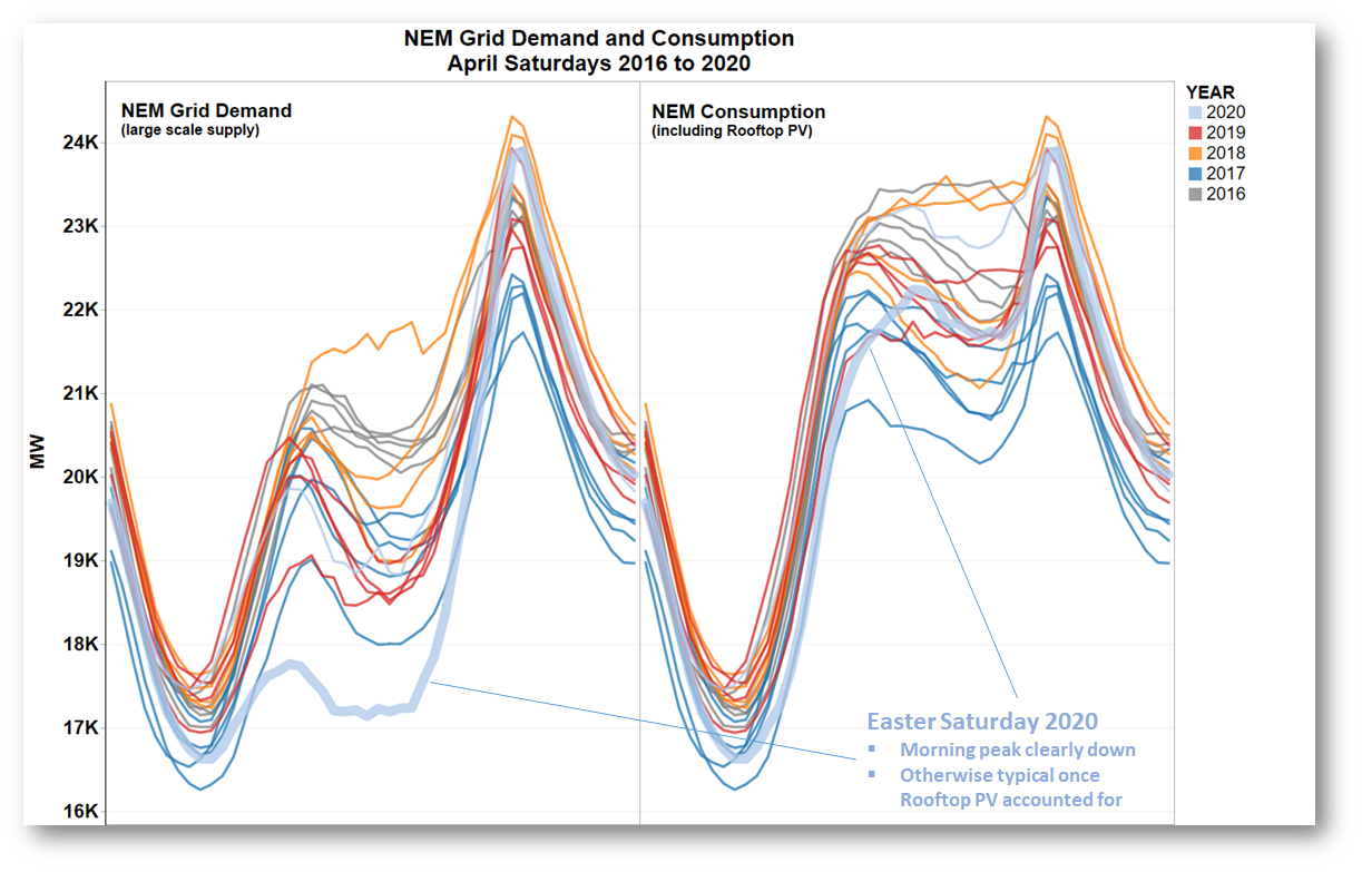 Each line here is the 24 hour curve for NEM-wide grid demand (LH panel), or with rooftop PV added in, consumption (RH panel), on an individual Saturday in April, coloured by year. Some of these will also be Easter Saturdays although I haven’t checked which ones. This year’s Easter Saturday is highlighted to see where it fits in the crop. Because of the rapid increase in rooftop PV installations in recent years we can see that last Saturday’s grid demand was certainly low through the day, but when supply from that rooftop PV is added back to yield the consumption curves, the only unusual thing about last Saturday was the clear truncation of the morning peak. That artefact I might be inclined to attribute to COVID-19, but the rest of the day falls right in the midst of the pack. So the 50% figure is not an artificially inflated share of an unusually low consumption level.
There’s a fair bit of debate about whether benchmarks like “50% supply from renewables” in and of themselves help, hinder, or just distract from more substantive issues in the energy transition – like what policy settings are appropriate and how best to technically manage the transition. Personally I think they are worth tracking, and trends are informative, but for policy goals per se we need to be looking at many other things.
A state-level view
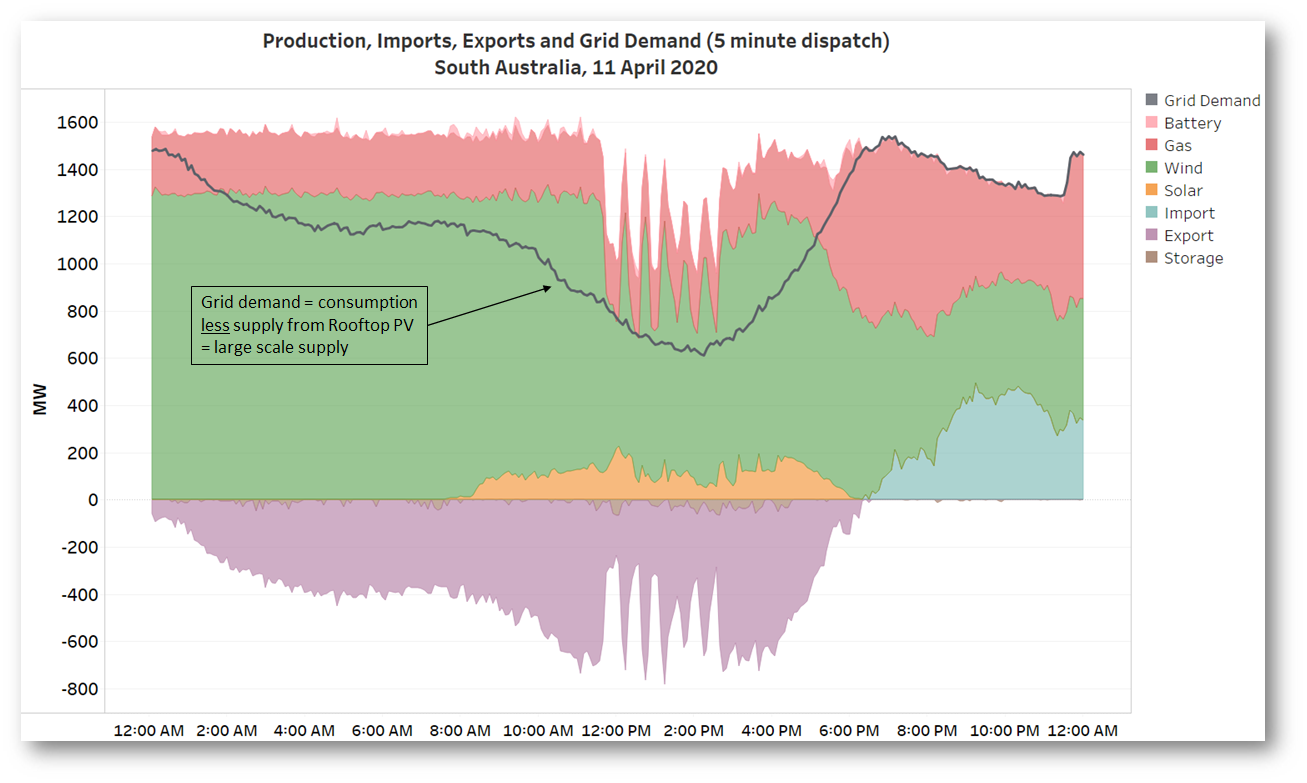
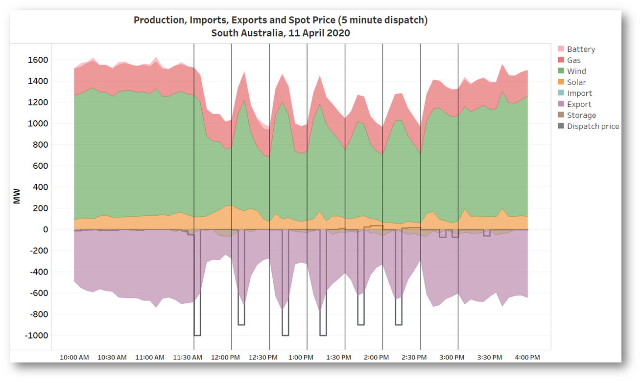
But while we’re on this metric, a quick look at a couple of individual NEM states on the same day. Here’s South Australia, the poster child for high renewables penetration:
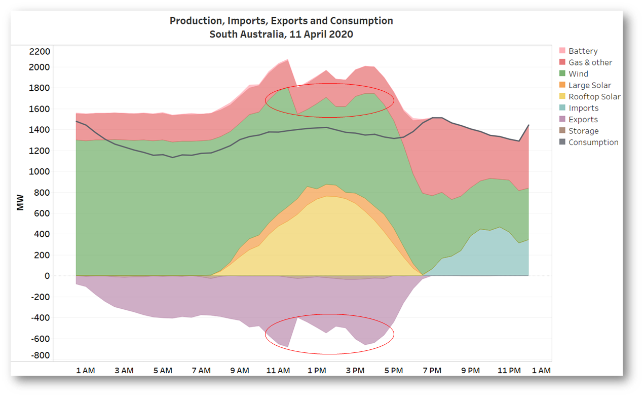 Obvious here is that from very early in the morning until sunset, renewables were supplying well in excess of 100% of local consumption, with lots of energy flowing across the interconnectors into Victoria and on to other NEM states. The gas fired generation running through the day was not needed to balance local supply and demand, and in fact some of it was directed to operate by AEMO, in order to ensure acceptable levels of “system strength” – an arcane but very important characteristic of the grid that reflects its resilience to faults and disturbances.
I’ve highlighted some odd-looking notches in wind output also reflected in corresponding variations in exports – more on this below.
But a first a trip next door to Victoria to see the half hourly supply mix there:
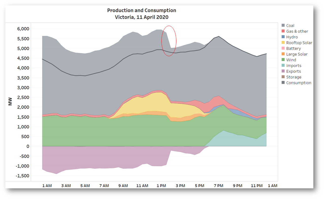 It’s clear that Victoria also reached the 50% benchmark for several hours, thanks to wind and PV, but the other thing standing out is sharp drop in coal generation.
Unit trips in Victoria
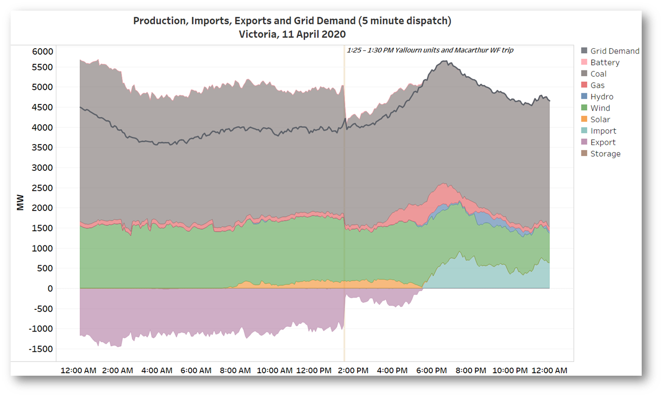
Paul McArdle quickly noted that this was due to three units at Yallourn tripping in close succession, apparently due to lightning strikes on transmission lines. At more or less the same time, nearly 300 MW of generation at Macarthur Wind Farm – which is geographically and electrically nowhere near Yallourn – went missing. A view at 5 minute granularity gives more detail, and shows close alignment between the times of the Yallourn and Macarthur trips:
 We have to remember though that even 5 minutes is aeons in the world of physical electricity, and a much deeper dive into events would be required to see exactly how closely these trips coincided. A patched together view of three successive 5 minute snapshots from ez2view also appears to show that one of the Yallourn units hung on for a little longer than its companions:
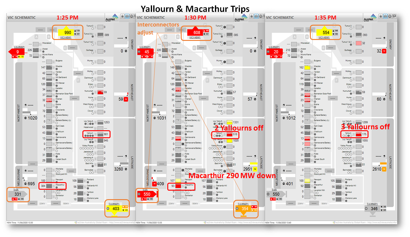 It’s still possible that all the Yallourn units went off within a few seconds of each other, and that timing discrepancies in the data snapshots that flow into AEMO’s market systems make it appear that there was a larger time separation. Normally, events like three coal units tripping and a loss of wind generation equivalent to a fourth would lead to very noticeable effects on price, and a much deeper examination in a post like this, but while Victorian prices rose (from close to $0/MWh to about $30-40/MWh) the impact was clearly damped by the plentiful supply conditions on the day.
What was happening with SA wind generation?
Without space here to dig further into that issue, let’s return to those notches in South Australian wind output noted earlier. Again, a view of AEMO’s 5 minute data (which doesn’t include detail that fine on rooftop PV) makes things clearer:
 That’s a strange-looking series of six very sharp dips and rebounds in wind output. Observers in the twittersphere were quick to ask what was going on, and again Paul was able to provide some insight:
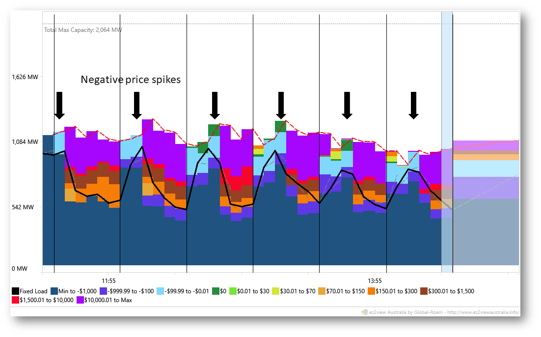
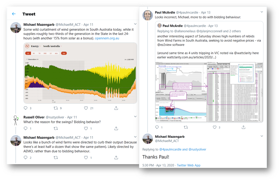 Paul was of course correct about the reasons; below I’ll provide a bit more detail, because this event highlights how operators of large scale renewables are having to become much more nimble in the way they operate in the market. First let’s look at overall market conditions just before this series of spikes, in this ez2view snapshot:
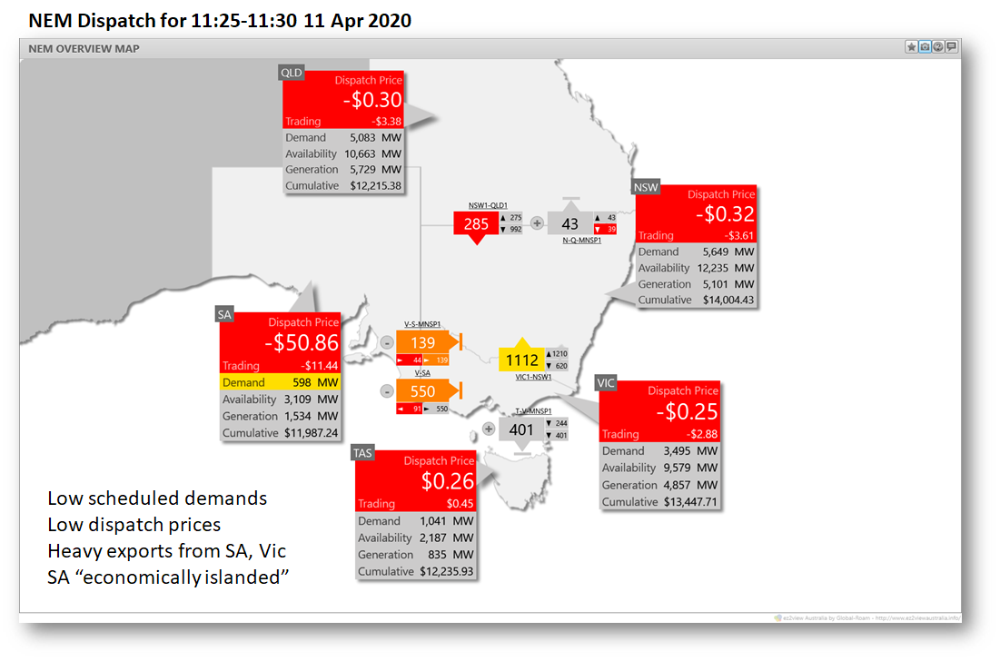 We can see very low and negative 5 minute prices around the entire NEM, and large flows of energy out of South Australia and Victoria into the other NEM regions. Also note the very low “Scheduled Demand” in South Australia – under 600 MW. This version of demand excludes supply from Rooftop PV and also older non-scheduled wind farms which aren’t subject to the NEM’s bidding & market clearing process – they just generate up to whatever level the wind lets them. On this view, more energy was being exported from the remaining controllable (scheduled and semi-scheduled) generators in South Australia than was being supplied to the state itself. Unsurprisingly, the interconnectors were at maximum secure capability, and prices in South Australia were already well in negative territory.
Constraints in operation
Not shown in that high-level snapshot is the fact that the semi-scheduled wind (and large solar) generators in SA were actually having their output pared back by a constraint related to the system strength issue I mentioned earlier:
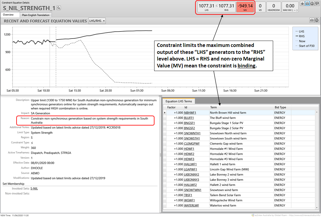
The fact that this constraint was binding means that the set of South Australian wind and solar farms listed could have been generating more, but AEMO’s dispatch engine NEMDE was controlling their output downwards to limit combined production, to satisfy the system strength constraint. Looking at bids through ez2view we can see by just how much their output was being held back:
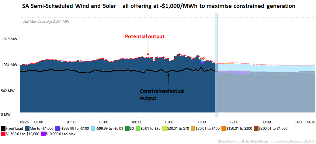 That gap between potential and constrained total output amounted to about 200-400 MW across the period shown. The chart also shows the pricing at which these generators were offering their energy – almost uniformly at negative $1,000/MWh! The reason for this is that when constraints like this are binding, AEMO’s dispatch algorithm winds back generation according to offer prices. If any one generator had been offering its output at (say) $0/MWh and the others at (say) -$50/MWh, then the “more expensive” $0 generator would have taken the full brunt of the constraint (ie reduced output) before any of the others. If wind and solar operators are seeking to maximise their output under a constraint, the logic of this process is that they all end up offering at the market price floor of -$1,000/MWh, and their outputs all get scaled back pro-rata to fit within the constraint.
Farm economics 101
You might wonder why these farms were so keen to generate at maximum levels even with prices at -$50/MWh as shown in the earlier snapshot – that’s because as well as revenue from the energy market, these farms also earn LGCs under the Renewable Energy Target which can have a positive value exceeding the cost of generating at negative spot prices, as long as those prices aren’t too negative. It’s also possible in some cases that it’s not the farm operator who bears the risk of negative spot prices, which may have been passed on to the buyer on the other side of a fixed price Power Purchase Agreement (PPA). That buyer would probably not be happy to see (and bear the cost of) generation at negative spot prices but unless their PPA contains explicit provisions dealing with negative price events, they may have no control over how the farm offers its energy to the market.
On the other hand, farm operators who are exposed to negative spot price outcomes will, logically, reduce their output if spot prices fall too far into negative territory. Farm operators who aren’t (because under a PPA they receive a fixed price for all output regardless of market prices), probably won’t.
Now, the risk that arises when lots of generators are offering their energy at the market price floor, demand is low, and exports are already at maximum is obvious. The spot price falls to that floor, as seen in this 5 minute zoom into the period of wind spikes:
 Adding dispatch price to the view makes it pretty clear what was going on on Easter Saturday – a series of 5 minute dispatch price “crashes” to -$1,000/MWh territory, followed by sudden reactions from at least some of the wind farms (ie those financially exposed to negative spot prices) to pull back their output for the remainder of the half-hour trading intervals on which energy settlements are calculated (delineated by the vertical lines). This is a precise mirror image of the 5/30 issue we’ve written about many times previously here on WattClarity. In the past it was generally peaking generators ramping up their output after a high 5 minute price spike that drew attention to this foible of the NEM design, but as the energy transition proceeds we can see that the same issue cuts both ways.
A mix of reactions
Taking one final deeper dive into the behaviour of wind and solar farms, we can analyse how they responded individually to these negative dispatch price spikes:
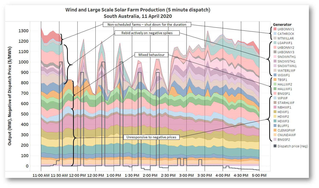 We see at least four types of behaviour, and in the chart I’ve grouped the SA wind and solar generators accordingly. Note that I’ve also reversed the sign on dispatch prices for compactness.
Unresponsive group
These farms ploughed on generating regardless of spot price outcomes. It includes a mixture of older non-scheduled windfarms like Wattle Point and Starfish Hill, but also more modern semi-scheduled farms like the Hornsdale group and Bungala 2 solar farm. Presumably none of the operators bidding these farms bear exposure to negative spot prices – I assume they weren’t just off on Easter holidays.
Mixed Behaviour group
This set of farms showed some response to the negative spikes, but it was variable. Bungala 1 solar wasn’t quite non-responsive, but movements in its output didn’t really correlate with dispatch price movements either. The two Hallett farms in this group seemed to react only to -$1,000/MWh spikes but not to -$900/MWh levels – perhaps they just offered at -$999/MWh? Tailem Bend solar was slow off the mark, then after the fourth spike just shut down completely.
Active Rebidding group
Farms in this group are generally newer and were clearly watching the market closely (very likely with automated rebidding systems) and rapidly moved their energy offers up from -$1,000/MWh in response to each negative spike (in some cases all the way to the market price cap of +$14,700/MWh) so as to have their dispatched output reduced for the balance of the half hour, trying to lower their exposure to negative settlement prices (calculated as the average of 5 minute dispatch prices across each half hour trading interval).
But with those trading prices still averaging around -$160/MWh (one sixth of -$1,000/MWh) across the relevant half hours, one wonders whether these farms might have done better emulating the last group which shut down altogether. Instead we see from the rebidding pattern below that like clockwork, at the beginning of every half hour more energy was repriced back down to -$1,000/MWh, and within a few dispatch intervals, deja view all over again as the dispatch price dived and some farms duly rebid to higher offer prices, but only for the balance of the current half hour. Perhaps their auto-bidding systems need a bit more tuning, or some machine learning algorithms built in.
Shut-down-for-the-duration group
This group of older non-scheduled farms shut down completely after the first spike and waited out the period of negative prices before returning. While these farms don’t participate in bidding, they are presumably still exposed to negative spot prices (market non-scheduled generation still receives the spot price – or pays it when negative – for generated output), and obviously their operators are able and prepared to cut off output in events like this.
In fact the semi-scheduled farms at Tailem Bend and Lincoln Gap essentially switched to this strategy after bouncing around on the first series of spikes.
So, a pretty eventful Easter Saturday. Hope you’re all keeping well.
About our Guest Author
 |
Allan O’Neil has worked in Australia’s wholesale energy markets since their creation in the mid-1990’s, in trading, risk management, forecasting and analytical roles with major NEM electricity and gas retail and generation companies.
He is now an independent energy markets consultant, working with clients on projects across a spectrum of wholesale, retail, electricity and gas issues. You can view Allan’s LinkedIn profile here. Allan will be sporadically reviewing market events here on WattClarity Allan has also begun providing an on-site educational service covering how spot prices are set in the NEM, and other important aspects of the physical electricity market – further details here. |
Leave a comment