
In the afternoon of Saturday 26th October 2019 I noted via this 1st article that AEMO had earlier forecast what would have been a record minimum demand for the South Australian region for at least 21 years (since the start of the NEM). However, as noted in the article the forecast turned out to be “off the mark” by about 200MW (a high relative “error” of 60% given demand was so low).
We only had to wait a week (till Sunday 3rd November) to see the Scheduled Demand in South Australia down at a record low of 367MW, destroying the prior record for the same measure* as discussed in this follow-on 2nd article.
Both articles have generated a fair degree of feedback (mostly direct), which has only helped to amplify our incessant curiosity… so (as time has permitted) we have continued to head-scratch and investigate…
(A) Why are minimum demand, and a missed forecast, so important?
It’s been a long time since we’ve given away a BBQ to the “best peak demand forecaster in the NEM” (and this summer we don’t have the breathing space to crack open that popular distraction either).
Speaking more seriously, though, there was a reason why we focused on peak demand NEM-wide all those years ago when we first established that competition – with a focus on peak NEM-wide demand. In simple terms, it was probably the single most important measure that played into so many different aspects of the evolution of the NEM over its first 10-15 years.
It’s not become irrelevant in more recent years (though there has been an explosion in different measures used for “demand” more recently, for a range of reasons). What has happened, instead, is that there have emerged a significant number of other variables that are all also playing an increasingly significant role in leading outcomes in the National Electricity Market and broader electricity sector.
This expansion of significant (interdependent) variables is one of the reasons why we highlighted, under Theme 2 in Part 2 of our Generator Report Card 2018, that the level of Risk in the NEM is escalating:

Rather than the (relatively) narrow focus on just relatively rare periods of extreme demand events, we’re shifting into an environment where there are a larger number of dispatch intervals where the NEM sees heightened risk because of a whole range of other factors, including:
1) (still) a question about what the peak demand will be – but also when it will occur (perhaps not so predictable as it might have been 10 years ago);
2) rising incidence of transmission congestion and the variability/volatility of transmission losses with our increasingly dispersed generation fleet;
3) much higher dependence of our generation fleet on different aspects of the weather, and our climate;
4) changes in pricing patterns as a result of various changes in bidding behaviours on top of the changes in the underlying physical realities (discussed here and elsewhere);
…. other factors
N) and also, increasingly, concerns about what the minimum levels of demand would be for a region (or across the whole of the NEM).
These minimum demand levels (and the extent to which it’s been “correctly” forecast) will increasingly feed into participant operating strategies, and also operating strategies for other organisations like the AEMO and NSPs. As with many data points in the NEM, the ability to forecast such things will assist in planning.
(B) Why would the Demand Forecast “Error” have been so high?
In my 1st article I deliberately did not use the term “error” to describe what happened on the day (for reasons discussed below) – but my understanding is that this did not stop some readers interpreting this as such.
We’re keen to explore (and its important for others to understand, more broadly) some of the reasons why the discrepancy would have been so substantial (especially in percentage terms). Here’s the same chart again, from the “Forecast Convergence” Widget in ez2view:

In this grid:
(a) The “actual” values for the half-hour are shown on the diagonal;
(b) Prior predispatch forecasts for that same variable at that same time are shown in the rows underneath the diagonal;
(c) Hence looking up a column (i.e. through successive forecasts), we can see that the actual value for the 12:30 trading period was considerably higher than actual
(d) To make this clearer, the low demand numbers are coloured deep blue whilst the higher numbers are coloured red – and it’s a sliding scale used.
(e) Also, for those unfamiliar with NEM concepts, all times used in this article (and in the majority of articles on this site) are in “NEM time” or UTC+10 hours.
Note that we were choosing to look here at the AEMO’s “TOTAL DEMAND” figure in the MMS – which is the Target for Scheduled Demand (the AEMO increasingly commonly talks about Operational Demand now, but Scheduled Demand still has its purposes and is the measure for which 21 years of history is available). Some of the gory details about measurement of demand are discussed here.
Because we’d chosen to focus on Scheduled Demand (on a trading period basis) in the original article, we’ll continue to focus on it here – however this trend for the 26th October (below) shows the difference between five of the common measures of demand published by the AEMO.
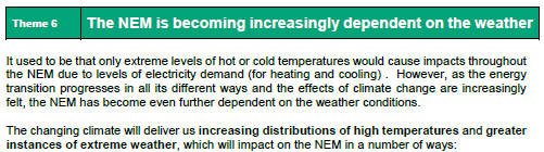
As discussed in Theme 6 within Part 2 of the Generator Report Card 2018, the NEM is becoming increasingly dependent on the weather:
There are several aspects of the weather that might impact on how the AEMO’s forecast for Scheduled Demand might have varied so significantly from what actually resulted. Weather is not the only possible contributing factor, however – so we take a broader look below.
Factor #1) The “Rate of Gross Consumption” is higher than expected
In our explainer, we talked about a layperson’s idea of what “electricity demand” should actually mean, which we can call here the “Rate of Gross Consumption (from all sources)”. Focusing on this holistic measure, there are a number of reasons why “Rate of Gross Consumption (from all sources)” might have been higher – including two big ones:
Factor 1A) Energy Consumption changed because of the weather
Weather conditions (particularly temperature) remain a significant driver of underlying of the Rate of Gross Consumption (from all sources).
Specifically, each degree of temperature increase above (or below) a certain ‘goldilocks temperature point’ (I think it’s about 22 degrees Celsius, but some more learned reader can help me out here?) drives increased electricity consumption for space cooling (or heating).
Currently we are not accessing or storing weather forecasts for use in our ‘Forecast Convergence’ framework within the ez2view software – but we are accessing real time measurements from the BOM for approximately 1,000 measurement locations across Australia – what follows is a trend specifically focused on Saturday 26th October:

For those who wish to access the query to continue their own analysis:
(a) Clients with access to NEMreview v7, can find a copy of this query here; whilst
(b) Clients with access to ez2view online can find their copy of the same query here.
In this trend, we can clearly see that the (hourly average) Apparent Temperature in Adelaide, Mt Gambier, Port Pirie and Whyalla rose between 10:30 (when that particular forecast for 12:30 was produced by AEMO) and 12:30 itself. However we should be very clear that:
Point 1 = whilst the increase in temperature (given they were so low) may well have reduced heating demand in places across South Australia (hence reduced Rate of Gross Consumption (from all sources);
Point 2 = we cannot conclude anything with respect to the difference between the 10:30 forecast and 12:30 actual…
… without access to historical temperature forecasts from 10:30 on the day, we are unable to conclude the extent to which what happened with the weather was different than what the AEMO might have been assuming at 10:30.
Factor 1B) Non-Scheduled Energy Consumption might have increased to take advantage of negative prices
As shown in charts below, the period in question coincided with the spot price in South Australia dropping below $0/MWh.
Across South Australia we have a number of clients as energy users (representing aggregate peak demand in the 100MW’s) that have various forms of spot exposure in their retail contracts (or they purchase direct from AEMO at spot prices. We know of a number of others who do something like this, but are not clients of ours. This is a form of ‘Demand Response’ in the NEM that has grown significantly over the past 10 years.
Such an arrangement does open the energy user up to incentives to increase consumption when spot prices are negative.
Worth re-iterating (as discussed in some detail here) that the Negawatt Dispatch Mechanism, as currently proposed in the AEMC’s draft rule, would not provide for this sort of price elasticity.
Such an increase would probably not have been taken into consideration by the AEMO at the time they were generating the forecasts at 10:30 for the 12:30 trading period. Some of these generators also have onsite generation, which they might have curtailed in order to increase net consumption (hence payments) from the grid during these periods.
Factor #2) Generation that’s not scheduled is lower than expected…
One of the big differences between the “Rate of Gross Consumption” and “Scheduled Demand” is that any generation that’s not scheduled is not seen in Scheduled Demand, but is assumed to act like “negative demand” – hence meaning “Scheduled Demand” is lower than “Rate of Gross Consumption”.
What complicates this further is that there are several different types of generation that are not scheduled – and (for each of these) several types of ways in which they might be producing less than expected in forecasts two hours previously. Hopefully this tables makes it clearer:
| Reasons why this generation might be lower than forecast | Type A = Larger Generators Registered but Non-Scheduled (though still seen by AEMO) |
Type B = Smaller Generators Registered but Non-Scheduled (and not seen by AEMO) |
Type C = Very Small Generators not even registered and certainly not scheduled |
| Reason 1 = Curtailed production due to negative prices Not shown in the two illustrations above was the fact that trading prices in South Australia through the period in question dropped into negative territory. |
In Scenario 1A, we have generators for whom AEMO receives SCADA data in real time curtailing production because: (i) They are spot exposed; and (ii) The price drops below zero.By virtue of the data published by AEMO for Initial MW, we explore this further below. |
In Scenario 1B, we have the same combination of factors – but a lack of visibility (for the AEMO or anyone else).
We know this happens, as we help a number of smaller solar farms operate in precisely this way (including in the SA Region of the NEM – as discussed further below. |
In Scenario 1C, the generator becomes smaller still (down to residential rooftop PV).
We wonder whether there are residential energy users (provided access to spot prices via offers from Amber Electric and others) who have gone to the extend of automating the curtailment of their rooftop PV systems |
| Reason 2 = Curtailed production due to weather effects
|
In scenario 2A, it’s clear that there might have been a loss of wind (or cloud cover depressing solar intensity) that resulted in less production from these specific generators.
If this were the case, it might be visible in the InitialMW data published for the units. |
In scenario 2B, the reasons might have been the same – however such an impact would have been invisible.
Further (to my knowledge) there is no attempt being made to understand the scale of these types of phenomenon. |
In scenario 2C, again cloud cover may well have had an impact on production from rooftop PV systems – to a greater degree than forecast 2 hours beforehand. |
| Reason 3 = Curtailed production due to other reasons
|
In scenario 3A, there may be other reasons why these larger Non-Scheduled generators might have curtailed production at these times. | Let’s call this scenario 3B. | Let’s call this scenario 3C. |
We’ll explore some of the scenarios noted in the table above in more detail below…
Scenario 1A) Registered (though Visible), but Non-Scheduled generation curtails at negative prices
In the growing Glossary section of the WattClarity site we’ve added this page to explain a little about generators curtailing to avoid negative prices (which is not immediately an intuitive concept – but one that is happening increasingly given the change in pricing patterns).
In the following trend we show stacked output of a number of Non-Scheduled generators (still large enough to warrant visibility to AEMO in their real time) in South Australia, and their trend of output over time:

For those who wish to access the query to continue their own analysis:
(a) Clients with access to NEMreview v7, can find a copy of this query here; whilst
(b) Clients with access to ez2view online can find their copy of the same query here.
The specifics of the curtailments for each of the units shown will be discussed separately here (LINK TO COME), in order to not distract from the overall direction of this article.
In aggregate we can clearly see that at least 150MW of generation supply that was there at 09:40 was absent by the time 12:30 rolled around. We note that 09:40 is earlier than the 10:30 forecast time in question, and discuss this further below.
Scenario 1B) Registered, but (Invisible and) Non-Scheduled generation curtails at negative prices
We need to remember we’re talking about the South Australian region and that (unlike the case of Queensland, where negative prices have been a bit of a shock to new entrant generators through 2019) generators have been exposed to negative prices in South Australia for a number of years.
This longer period of experience with negative prices in South Australia has provided the lead time for a number of smaller solar farms (some still registered with AEMO and market-exposed, but invisible to them in real time) to implement automated methods to assist with curtailment of solar output when the spot prices drop below $0/MWh:
(a) We are already serving some of these;
(b) As noted here, there are some nuances involved in doing this properly – we have heard of a number of examples (in SA and elsewhere) of others where it has not worked so well, including because they’ve been looking at the wrong numbers (easy to do, as a ‘beginner’s mistake’);
(c) I tweeted here last week about one particular case where we have helped.
(d) In essence, this is the same type of approach as we’ve been taking in facilitating Demand Response at large industrial energy users for a decade or more – just in reverse.
I highlight this particular scenario to highlight that (in addition to the 150MW+ of price exposed curtailment above) there would have been additional volume of supply withdrawn in South Australia on Saturday 26th October – though not visible to AEMO in real time, and certainly difficult to forecast.
Scenario 2A) Registered (though Visible), but Non-Scheduled generation drops output as sun/wind fades
In the stacked generation output trend chart above, we see that output from Starfish Hill Wind Farm continues through the entirety of the period of negative prices – so we conclude from this (notwithstanding this disclaimer) that they are impervious to negative spot prices – or at least were on 26th October 2019.
What does appear to happen, though, is that the output fades away through the afternoon, coincident with (though not caused by) the negative price periods. Breaking this data out into its own trend view below we can explore in further detail:

You’ll note that I have also added on the wind speed (and wind gust) readings for “PARAWA (SECOND VALLEY FOREST AWS)” – which is the BOM measurement location we calculate is closest to the Starfish Hill wind farm. Eyeballing this data, it does seem that there is some correlation with reduced wind speed (and particularly wind gust) and the reduced output through the period from 10:30 to 12:30 on the day.
We wonder (but again, we can’t answer, as weather forecasts are not currently in our data set) the extent to which this particular (wind lull induced) reduction in output might have appeared ‘out of the blue’ and surprised the AEMO?
We have no way of knowing this given our current data limitations (though some reader with access to data we’re missing might like to comment).
Scenario 2C) Invisible Generation (Not Registered and certainly not Scheduled) drops output as sun/wind fades
One of the largest (and fastest growing) types of “invisible generation” that falls into Type C generators column in the table above is rooftop PV deployed across residential and commercial rooftops across South Australia.
In June 2016 I noted about the opacity of small-scale solar PV output, and will have an updated article produced shortly on that front (LINK TO COME). There is considerable uncertainty about the contribution made by rooftop PV to netting off “Rate of Gross Consumption” down to the “Scheduled Demand Figure”.
Looking firstly at estimated actuals, we include here a trend from three different estimates (two from AEMO and one from APVI) which show a wide degree of variability in estimating what the contribution actually was on Saturday 26th October:

If we look just at the trace of half-hourly contribution for AEMO Method 2 (which the AEMO perhaps confusingly calls “Measurement” and says uses a “sample and extrapolation” derivation methodology) we can see that there is a drop in aggregate output suggested that occurred over the hour to 12:30 – the result of which might be inferred to mean a loss in invisible generation (and hence an necessary increase in scheduled demand) of approximately 60MW.
To muddy these opaque waters further, we take a look at what the AEMO has published afterwards here for their forecast (at 10:30) of the contribution that aggregate rooftop PV would make by 12:30 on Saturday 26th October:

We’ll see here that there are 4 different forecasts that the AEMO produced at 10:30 for where the aggregate contribution might be at 12:30 and that there was a fair degree of uncertainty in these forecasts (i.e. spread between them). When we couple these 4 forecast scenarios with the 2 x different AEMO “actuals” (ignoring the APVI estimate at this point given it is not an “apples to apples” comparison) we arrive at 8 different permutations for what the “discrepancy” might be over that 2-hour time gap.
Hence, in truth, the best that I think we can note is that:
Conclusion #1) It appears likely that there was an unforecast loss in the contribution of “invisible generation” from rooftop PV, probably due to increased cloud cover – which would have resulted in an unforecast additional amount of visible generation being required (hence increasing Scheduled Demand); and that
Conclusion #2) The size of this loss/increase might have been of the order of 60MW-100MW, but we don’t really know.
Scenario 3 (A), (B) or (C)) Generation that’s not scheduled disappears for other reasons
There may be other reasons (other than weather, or price) why either “gross consumption” might have been higher than forecast, or non-scheduled generation lower than forecast over that period. Perhaps readers can point these out in comments below?
(C) Why Forecast “Error” does not necessarily mean Forecast “Mistake”
It’s worth also noting here that it’s probably more appropriate to think of this difference between the forecast and the actual as a “discrepancy” – and certainly not a “mistake”.
As we have seen (above) one of the main factors contributing to the demand being higher than forecast was that there was a volume of non-scheduled generation (across various Types) that curtailed its production in response to the spot price dropping below $0/MWh. From a mathematical point of view, had AEMO assumed that this (curtailment) outcome was going to happen ahead of time in its forecast, it’s likely that the outcomes that would have eventuated might have been quite different (e.g. perhaps no negative prices, hence curtailment of generation?). When looked at this way, the discrepancy was a necessary outcome of operating the market/system as required.
As noted at the end of this 1st article back on 26th October itself I noted that this event was:
“an illustration of the challenges AEMO will increasingly face into the future.”
Hopefully the above exploration will help to illustrate this in more detail…
(D) Further down that Rabbit Hole about participant responses to negative prices…
Readers might recall that we’ve published 3 Case Studies recently from a larger number of Case Studies prepared internally for a number of different reasons.
Given that the variations in price-responsiveness is something that’s of keen interest to us, we’ve been working through the specific case of 26th October amongst different types of generators and will have more to present as a different style of Case Study at some future point (and will LINK BACK IN HERE when we are done).
(E) Do you know of people who can help us?
Once again, I would refer readers to this prior query about whether you know of people who can help us with respect to these two core capability areas? If so, please let us know (or put them in touch with us). Thanks to those who have already contacted us in this respect….
Leave a comment