Following on from comments received (online and offline) with respect to my article a couple weeks ago with respect to see-saw wind generation in South Australia (and hence prices as a result) I have been pondering a couple of things – but unfortunately no time to dig deeper.
With a short amount of time late last week, I powered up NEM-Review to begin the task of delving further, but have had to curtail that contemplation to come back to the here-and-now. Rather than leave the analysis I’d done gather dust, I’ve presented two charts here for a sample of 21 wind farms in the NEM highlighting two key metrics that, I believe, sum up the two sides of the puzzle:
1) Capacity factors
The sense I have picked up by reading commentary (and hearing comments) by people interested in wind energy in recent years is that there are people who sit at either end of two extremes:
1a) At the bottom end, there are those who operate with a rule of thumb that wind farm capacity factors will be 30% (with a layperson possibly inferring, from such comments, that this forms an upper bound to the capability of wind farms); whilst
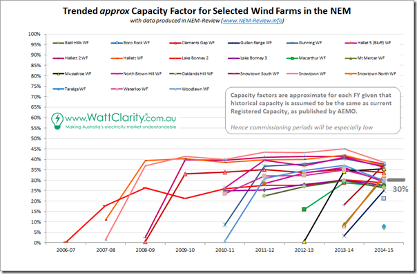
1b) At the other end, there are those who speak about wind farm capacity factors of 45% and above (with the same layperson, if listening to this other conversation, possibly inferring that most wind farms will be achieving this 45%-and-above, whilst the 30% mark is an out-dated one of yesteryear).With reference to 21 of the wind farms currently operational in the NEM, here’s how they have actually performed:
We can see from the above that, with the plant selected, the capacity factor did reach as high as 45% (one wind farm in one year shown – Snowtown in SA in 2013-14), but that there are also a number of wind farms bumping around at, or below, the old 30% mark.
There is a fair spread of capacity factors from a low of 25% to a high of 45%.
There’s a few series on the chart, so I have tried to make it more useful by colouring wind farms in SA some shade of red, wind farms in VIC green, wind farms in NSW blue and the only TAS wind farm shown black (my apologies if I made a mistake in some of these).
What we can see, in the above, is that the wind farms in South Australia are the ones which are achieving the higher capacity factors – which provides some answer* to the question I asked back in this post here
These higher capacity factors are especially relevant when considering that a significant proportion of the revenue earned by wind farms is a “simple” $/MWh measure (through the LRET target) that does not take account of the effect that increased production of energy from wind has on the broader energy market.
Wind Farm Revenue = LRET Market Revenue + Energy Market Revenue
The remaining amount of the the revenue earned by wind farms (Energy Market Revenue) is, however, affected by these locational factors – as discussed below.
2) Spot revenue “penalty”
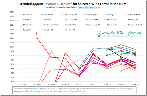
The other side of the coin is shown in the second chart, below – where I have calculated the average spot revenue earned by each of the wind farms. I’ve then taken that number and expressed this as a ratio to the time-weighted average spot price for the region in which the wind farms are located.
For ease of understanding, the same colours have been used:
Ratios less than 100% show that the wind farm is earning (per MWh) less than the average spot price for the region. In contrast, the volume-weighted average price for the year (i.e. paid by the “average” energy user) is typically above the time-weighted average spot price – because spot prices typically are higher when demand is higher.
As can be seen in the above, wind farms in South Australia are (by this measure) “under-earning” their counterparts in the larger regions because of the larger depressing effect wind has on spot prices the South Australian region because:
(a) Wind farm output shows high degree of correlation across South Australia (as all readers can observe by watching the NEM-Watch Live-Gen widget on RenewEconomy or in more detail in NEM-Watch itself); and
(b) Especially because aggregate wind farm output (when windy) represents a significant percentage of the demand in the region.In other words, performance to date of the LRET has seen a high proportion of wind attracted to SA because of higher capacity factors on offer – despite the fact that the large volumes of energy dumped into the energy market as a result are eroding the return all SA wind farms* are earning for their NEM component.
* note – “return all SA wind farms…” might be more correctly labelled the returns earned by the counterparties exposed to spot prices for the revenue earned. That’s probably a key distinction.
3) Questions for the future
It seems likely to me that the future will see even more of this dichotomy emerge in the South Australian region (i.e. lower prices when the wind is blowing and sun in shining, versus higher prices as thermal plant seek to recover fixed costs over less MWh when it’s cloudy and still).
Hence the “Revenue Discount” shown above for SA wind farms will continue to grow – which might lead to its own form of self-perpetuating spiral.
Now that there is (perhaps) some “certainty” about the 2020 target for the LRET, and stakeholders think more about what the trajectory might be out into the future, perhaps considerations might be given to whether simply continuing a split revenue-stream model and increasing the target is the most appropriate mechanism.
I will continue to ponder this aspect of the evolving energy market and (as time permits) continue to analyse and post insights earned on WattClarity®.
4) Considerations for All Energy
As noted back in that other article, I am slated to speak at All Energy on 8th October, and so will really need to start digging deeper soon to be able to have something meaningful to say.
In particular for that talk, I’m puzzling about the interaction of intermittent wind and intermittent solar on the supply side (with decreasing thermal capacity to cover for cloudy, still weather) and what could potentially be much more flexible demand patterns on the other side of the equation (with heightened price-responsiveness, more demand response, and storage of course).
If you’re also particularly interested in this intersection, I’m keen to hear from you in the next couple weeks – tel +61 7 3368 4064.
If you’re going to be at the conference, I’ll look forward to saying hello!


A very similar pattern will emerge in Qld with solar PV (farms) and as they start to ramp up and build more capacity towards their 50% target. Spot prices here are already feeling effect of PV, and as growth in PV continues (both small and eventually large-scale), spot prices will continue playing less of a contribution to revenue-earning side of the project.
Re Alan’s comment, for PV + battery there is one recharge-discharge cycle per day to recoupe a battery or pumped hydro investment, and combined with wind or coal for night charging there are 2 cycles. Periods of high wind occur on approximately a 3-day cycle, so it would take much longer to recoup a battery investment.
Queensland already has one pumped-storage hydro station that could reduce some of this volatility.
Re the article, some of the South Australian discounts will spill across to Victoria when the Heywood interconnector upgrade is completed (190 MW of additional capacity). Since the main Vic and SA wind farms have highly correlated wind speeds, this will increase the discounts for Vic wind farms.