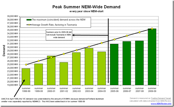
As we noted in January 2009, this summer saw an absolutely massive new record set for peak demand (35,478MW on 29th January 2009, reported on a Dispatch Target basis).
What is “Demand”?
As such, demand reported here is reported on Trading (30-min) Interval basis – being the time-weighted average of 6 x 5-min Dispatch Demand Targets in the Trading Interval. Hence, when speaking about demand peaks, they will be lower (on a Trading Interval basis) than on a Dispatch Interval basis.
It did surprise – that’s what we saw in our Competition!
Coincidentally, over summer 2008-09 we had also re-introduced our “Best Demand Forecaster in the NEM” competition.
To provide some assistance to the broad range of entrants we tend to interest with competitions such as these (ranging from traders, to a whole gamut of people with only a peripheral focus on the NEM), we prepared a “Cheat Sheet” in which we provided some analysis of how NEM-Wide demand had grown over the previous 3 summers. We reasoned that Tasmania had not been part of the NEM prior to summer 2005-06, hence it probably was not worth performing analysis any further back than that.
If you have a look at the entries received in our competition, we saw that the range of entries tightened up significantly for summer 2008-09, compared with the range of entries we received back in summer 2005-06, when we ran the competition for the first time – it’s clearly visible when comparing the two graphs.
In our own feeble defence(?) I should clarify here that far more than half of the entries, by number, were received from people working as traders in a generator, retailer or trader (and other companies that know a thing or two about the market).
Hence, these people would all have had some background to the market, and would not (I would think) have been wholly swayed by our analysis.
Wherever their source of information, it does seem like our range of entrants were sufficiently confident that the recent history would continue to cluster very tightly around an expected peak NEM-Wide demand of approximately 32,500MW (remember, here, that a BBQ was provided as the prize – so there was enough incentive, I would think, for every entrant to give it their best shot).
Perhaps I’m “reading too much in the tea-leaves”, but it does seem that the collective thought of “the market” (or at least the cross-section of the market that participated in our competition) was that a focus on short-term history (by which I mean only the past 3 years or so) was sufficient to identify what was likely to happen for that summer.
As it turns out, the peak demand for summer 2008-09 was much higher than that estimated by ALL of the entrants in our competition. Hence, we were all collectively surprised by what happened.
Hence, it looks like we were all wrong, and a longer-term review of history was in order…
What if we looked over 11 years of history, instead?
With this thought nagging us, we finally found the time (this week) to have a look further back into history.
We looked as far back in history as we have similar data for the whole of the NEM (back to NEM-start on 13th December 1998). The following is what we found:

Figure 1 – Peak Summer NEM-Wide Demand
Our first chart provides a view of the peak summer demand for each of the 11 summers experienced since the start of the NEM.
As noted in the chart, keep in mind that the Tasmanian region only joined the NEM in time for summer 2005-06 – which accounts for some of the step-change in demand we can see from summer 2004-05 to summer 2005-06.
We checked, and the Tasmanian region demand was 1,124MW at the time of peak NEM-Wide summer demand in 2005-06. Hence, you can use this number to gauge the effective year-on-year growth in demand prior to this.
With the straight black line on the chart, we indicated what the growth trajectory would have been like had it been uniform over each of the 10 year gaps to summer 2008-09. In doing so (see at the left-hand end) we have “stepped up” demand in years prior to summer 2005-06 by 1,124MW – to reflect what would have been the case (roughly) if Tasmania had been part of the NEM in earlier years.
From this chart, it can be clearly seem that the level of peak demand seen in the 4 previous summers (2004-05 to 2007-08) was lower than would have been expected, if just interpolating over the 11-year range of NEM history.
In other words, part of the reason the NEM-Wide demand peak in summer 2008-09 seemed so high was that the previous 4 summers had been relatively mild ones (in terms of the levels reached for NEM-wide demand).
Hence, those who had been mainly looking at the past couple of years of history (including us) to predict what would happen in summer 2008-09 were lulled into a false sense of security.
Let’s look more closely at the Year-on-Year growth in peak demand
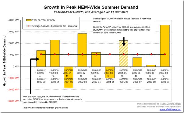
We next took the data shown above to calculate what the growth in demand was, on a year-on-year basis. This is shown in the following chart:
Figure 2 – Year-on-Year Growth in Peak DemandAs can be seen clearly in this chart, the increase from summer 2001-02 to summer 2002-03 was the last time a significantly above-average growth in demand occurred, and that was seen to be after a very mild summer (summer 2001-02) where peak demand was significantly below the previous year.
Hence, we have to go all the way back to the three initial years to find rises approaching that seen in the most recent summer.
In percentage terms?
The implications in Figure 2 above become clearer when we see the same increases, but shown as a percentage increase in the peak demand of the earlier summer. This is shown in the following chart.
Figure 3 – Year-on-Year Percentage Growth in Peak DemandIn this chart we can see more clearly that the increases seen in the early years of the NEM were of the same relative magnitude as that seen to summer 2008-09.
Hence, the main conclusion we can make is that the astonishing growth in peak demand that surprised us (and, evidently, many others) in summer 2008-09 should not have been entirely unexpected. Granted, jumps of this order are not seen to happen every year, and it may be practically impossible to predict in which specific year they will occur next – however, given they have happened in the past we should, at least, be cognisant of the fact that they are likely to happen in the future at some stage.
Did Demand Diversity play a part?
One final question today – though I will be the first to profess that I am not an expert in Demand Diversity (not any more than a novice, in terms of understanding this concept).
My understanding is that it’s a general measure of the degree to which the peak demand days in each region DON’T align – i.e. because it’s practically never stinking hot in all regions at the same time over summer, demand won’t peak in all regions at the same time – meaning that there can needs to be less spare capacity held in reserve across all regions to cater for the times when demand is hot in some parts but not others.
Indeed, the snapshots from NEM-Watch included in the article we wrote on 29th January do highlight how demand was exceptionally high in VIC and SA, whilst moderately high in NSW, relatively less extreme in QLD and positively mild in TAS (relative to each region’s all-time maximum demands – the colour-coding of each region in NEM-Watch makes this very clear). Hence, diversity was at work on that day, meaning that the peak NEM-wide demand was lower than it would have been had the weather patterns fully lined up.
It did make us ask the question, however – has the degree of Demand Diversity changed over time?
Hence, we have compiled the following chart as an extension of Figure 1 (above) by also including a summed non-coincident regional peak demands experienced in the same summer, and highlighting the ratio of the two demand numbers [Actual Peak / Theoretical, Aligned Peaks]
Figure 4 – Peak Summer NEM-Wide Demand, and Demand Diversity at PeakAs can be seen in this chart, there was less diversity of peak demand levels experienced in summer 2008-09 than in the 4 years immediately preceding (i.e. when it was hot, it was more likely to be hot everywhere).
However, the ratio seen in summer 2008-09 was not as high as the level shown in summers 2000-01 and summer 2003-04 (although it should be noted that those ratios will have been affected by the fact that Tasmania was not part of the NEM at the time).
There is a correlation that is clearly visible to us in Figure 4 – in the years in which demand spiked sharply upwards (2000-01, 2003-04 and 2008-09) the level of demand diversity is distinctly lower (i.e. the ratio is higher) than is seen in the years immediately preceding the spike. In other words, when demand surges significantly, it does appear due to hot weather aligning moreso (though still not completely) across the NEM.
In summary, it does not appear that there is anything particularly different that occurred in summer 2008-09, when compared with other summers in which demand had surged in previous years. Certainly it does not appear to have been due to hot weather aligning more than in any of the previous 10 summers.
Incidentally, who thinks in terms of NEM-Wide Demand, anyway?
One final thought for today –
Despite the fact that we have a National Electricity Market (and despite that the interconnectors do facilitate inter-regional trade most of the time) we see that the majority of participants and observers still seem to think of the NEM in regional terms – which means that demand is still reported on a regional basis and peak demands are still primarily reported on a regional basis.
Our “Best Demand Forecaster in the NEM” competition was one small way in which we have been seeking to help people think more about the implications of demand growth, on a NEM-wide basis as well as on a more localised (regional, and sub-regional) basis.


Leave a comment