
1) The NEM reaches 10
For those who are unaware, 13th December 2008 marked the 10th Anniversary of the inception of the NEM. We released a short review of NEM history on that day to commemorate.
Given the occasion, however, we thought it would be useful to have a look, in more detail, at what has happened over the past 10 years.
Taking a slightly different approach, we’ve opted to review each month at a time – hence, this is one of twelve articles posted on this site at the same time.
2) 10 years of September
Through the NEM-Review software, we have prepared this illustration of how (average and peak) NEM-Wide Demand for electricity has grown over the past 10 years.
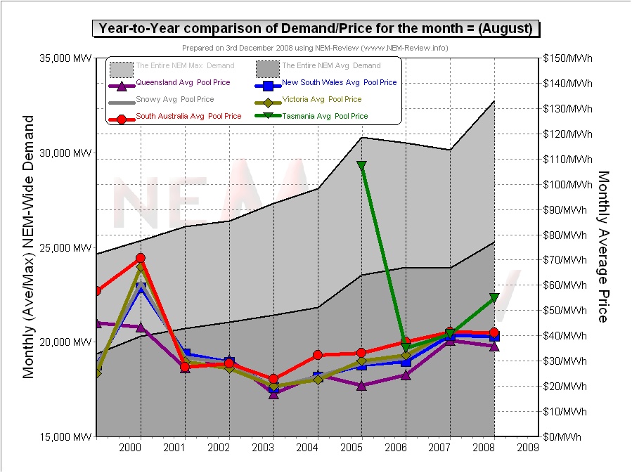
With respect to this chart, two things in particular need to be noted:
- Tasmania only joined the NEM in mid-May 2005 – hence the data for September 2005 shows the effects of Tasmanian region demand for the first time.
- The measure of “demand” calculated in NEM-Review v5.3 is the (30-minute) Trading Demand Target, which is the time-weighted average of the (5-minute) Dispatch Demand Targets over the half hour:
- Hence, the demand shown here is an output from NEMMCO’s NEM-DE (Dispatch Engine) and not a metered demand. In most cases, the numbers will be very similar, but they will vary from figures quoted elsewhere for “maximum demand”
- This is further explained in the glossary on the NEM-Review portal.
3) Quick Links
As the following table is quite lengthy, we’ve included here Quick Links to each of the 10 years included in the table below:
- September 1999;
- September 2000;
- September 2001;
- September 2002;
- September 2003;
- September 2004;
- September 2005 (including Tasmania for the first time, from mid-September);
- September 2006;
- September 2007;
- September 2008
4) Each Year at a time
In the following table, we touch on the highlights of some of the September months that have passed, since the creation of the NEM.
|
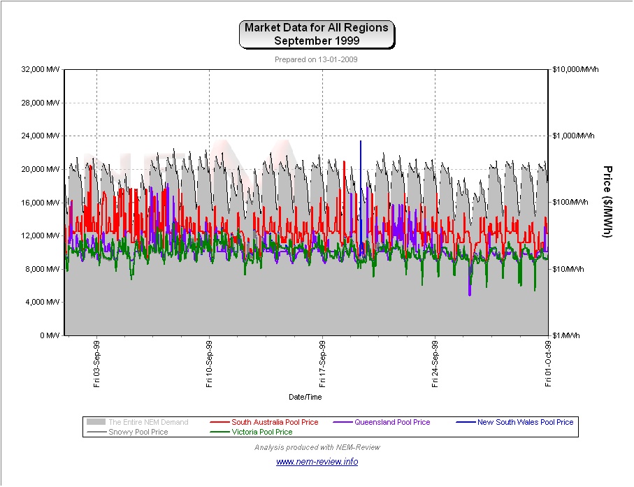
September 1999 |
As highlighted in the diagram above, September 1999 saw very low prices in all regions, with the exception of South Australia.
|
|
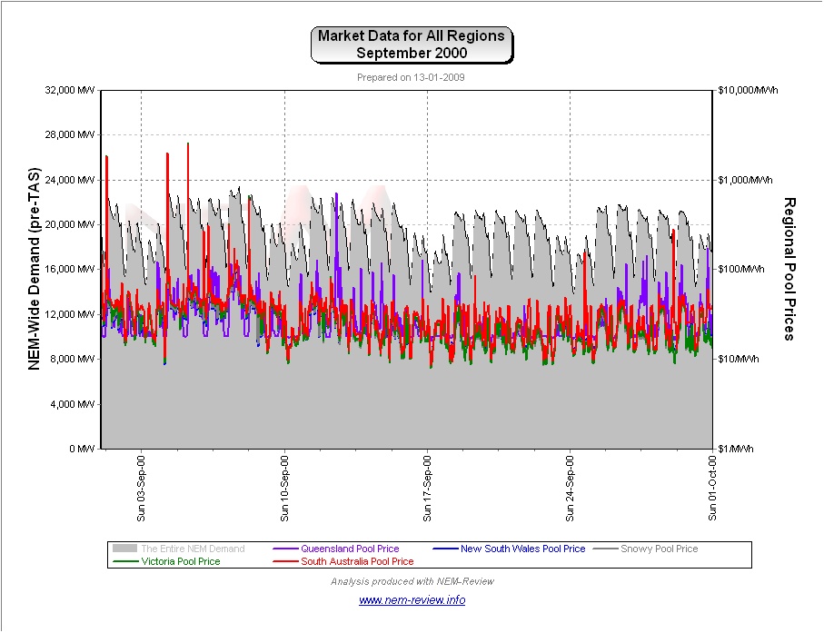
September 2000 |
The main chart (above) illustrates that prices rose significantly in all regions in September 2000 (compared with September 1999) except SA, which softened slightly.
|
|
September 2001 |
September 2001 saw prices subside in all regions from their levels in September 2000.
|
|
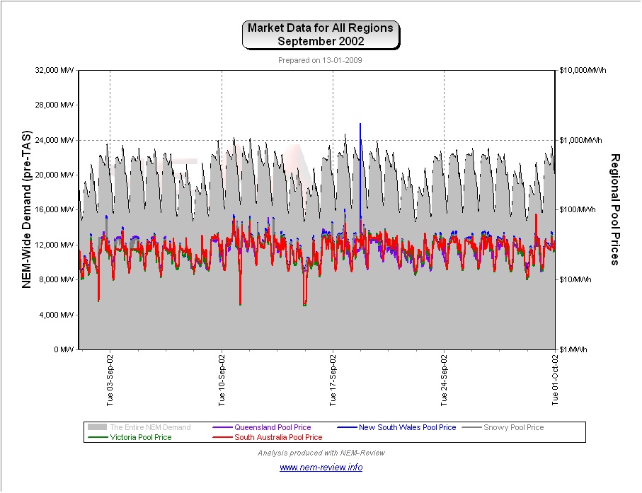
September 2002 |
September 2002 saw average prices rise slightly (from their levels at September 2001). The following chart (from NEM-Review version 5.3) provides more detail about what happened over the month.
|
|
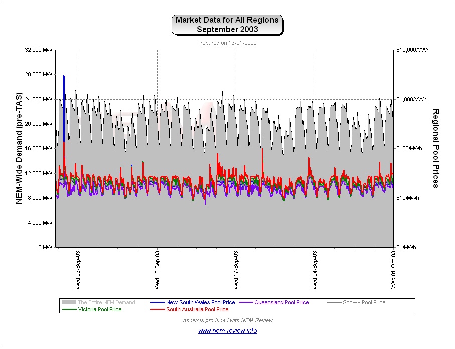
September 2003 |
As noted in the chart above, prices were lower across all regions in September 2003 (the lowest of all 10 x September-months). Importantly, we see that this occurred despite a significant jump in (average and peak) demand in the 12 months to September 2003. That prices would fall despite a sharp jump in demand is indicative of the large amount of low-cost new capacity that had been brought into the market through 2002 and 2003 (i.e. 1200MW at Millmerran and Tarong North). This is also why prices in QLD were the lowest of all NEM regions.
|
|
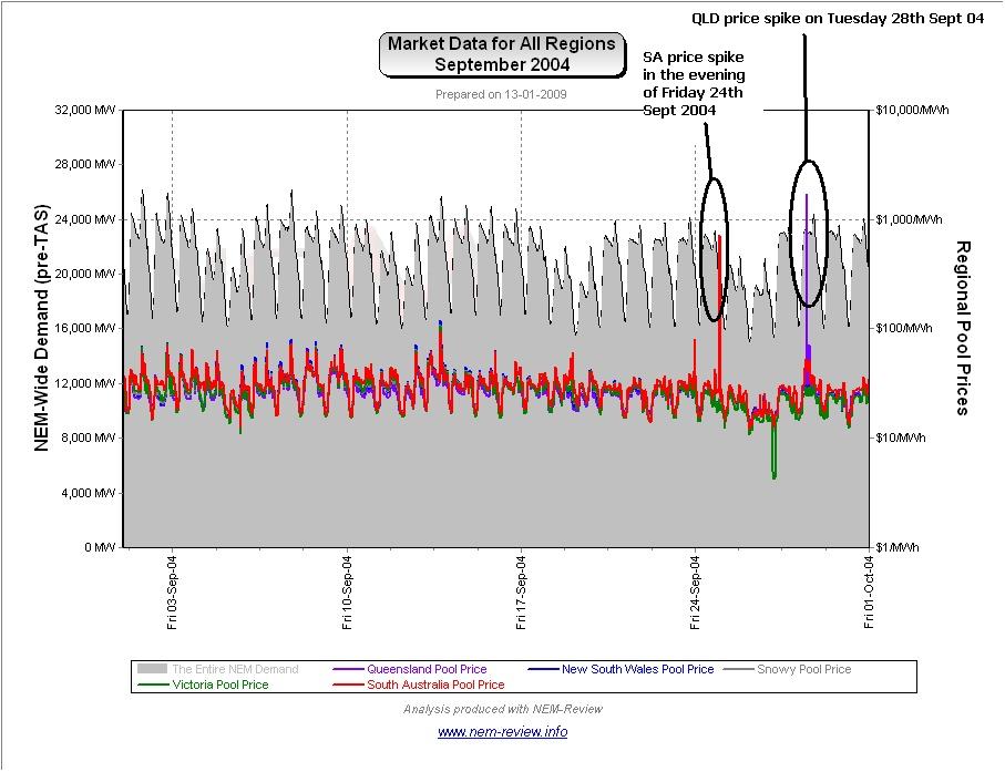
September 2004 |
As shown in the main chart (above) September 2004 saw prices recover back to the levels seen in September 2001.
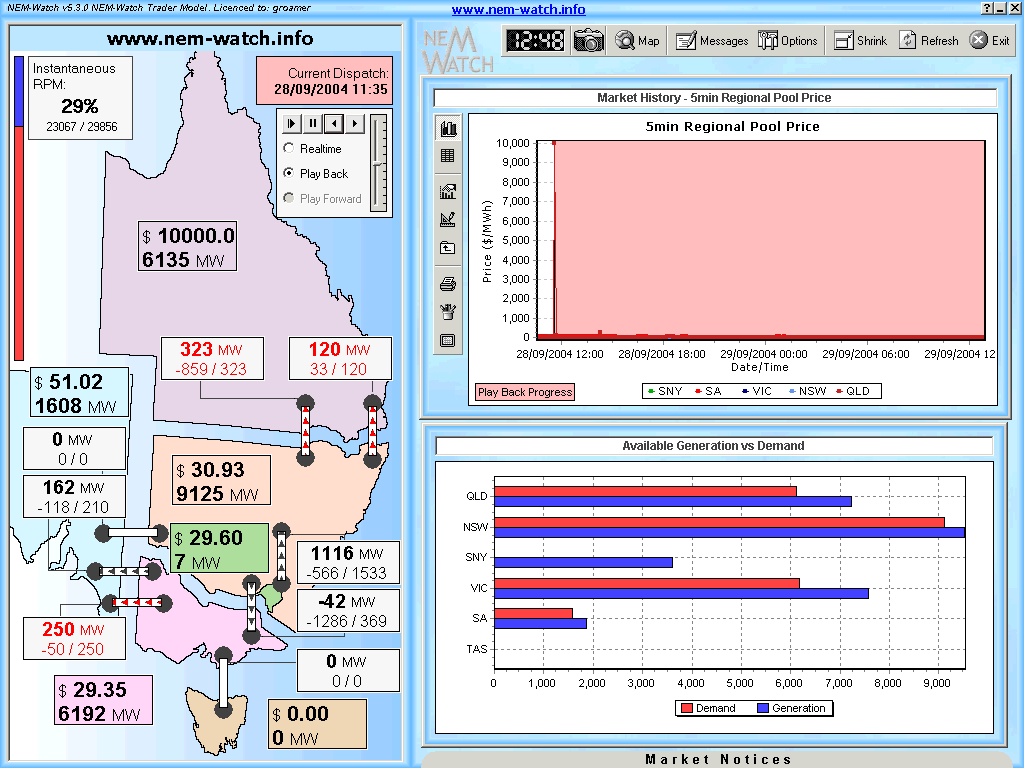
As can be seen, September in 2004 was a month of low price volatility (as it had been in the preceding 5 years as well). Through NEM-Watch version 5 (using playback mode , and the snapshot facility ), we did make a record of one of only two times in the month when the price jumped significantly, below:
As can be seen in this snapshot (of 11:35 dispatch interval on Tuesday 28th September 2004), the QLD price had risen to VOLL with both interconnectors importing at their maximum capacity of the time. As such, we would now term the QLD region as an “Economic Island” for that period. Without delving into our detailed database, it would appear that QLD had about 7,200MW of available generation at the time (reflecting, we presume, a large amount of capacity out on maintenance in preparation for summer). This generation capacity was required to supply the 5,692MW of local QLD demand (i.e. regional demand less that supplied from NSW). Thus, the 1500MW of space capacity represented an IRPM of approximately 26% for the QLD Economic Island (compared with 29% for the whole NEM). Hence, whilst the QLD region had marginally less capacity, in relative terms, the levels were still quite healthy – hence the VOLL pricing must have been due to any of a number of different reasons (which have not been further investigated). |
|
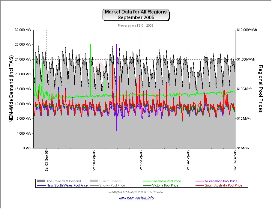
September 2005 |
As noted in the chart above, prices climbed slightly across all regions in September 2005 (except in QLD, where they declined slightly).
As can be seen, TAS prices were totally independent from prices on the mainland in 2005, prior to the commissioning of Basslink. |
|
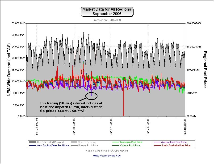
September 2006 |
As the main chart above shows, September 2006 showed that prices continued to nudge upwards, compared to previous years – with prices in Tasmania converging on the mainland (given the commissioning of Basslink earlier in the year). The exception to this increase was a further decline in average prices in QLD.
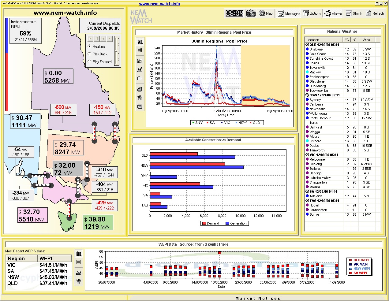
Indeed, as shown in the following snapshot (from NEM-Watch version 6) there was at least one occasion when the dispatch price in QLD was $0/MWh in the month.
|
|
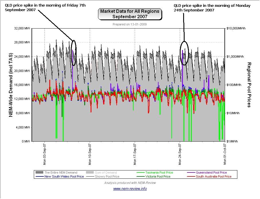
September 2007 |
As shown in the main chart (above), average prices in September 2007 were significantly higher than in previous years – but nowhere near the huge levels seen in other months of 2007. This occurred despite the fact that demand in September 2007 was almost identical to the levels seen for September 2006.
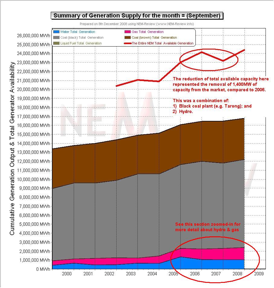
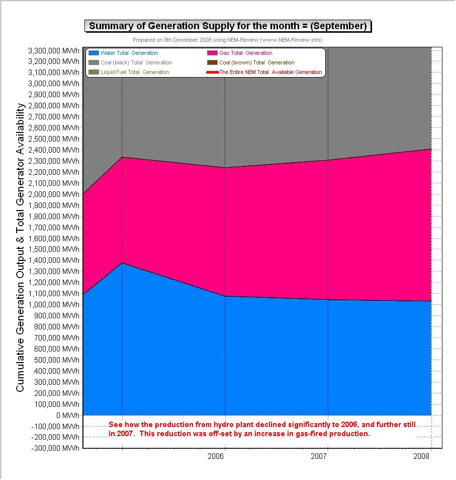
Our review for April highlighted the reasons why the drought meant 2007 was a unique year, amongst the 10 years of NEM history to date. Particularly for September, we have performed additional analysis (in NEM-Review) to highlight how the drought delivered: 1) A decline in the amount of available generating capacity equivalent to approximately 1,400MW of capacity, NEM-Wide (as shown here). Keep in mind that from 2006 to 2007 the (peak and average) September demand was virtually the same
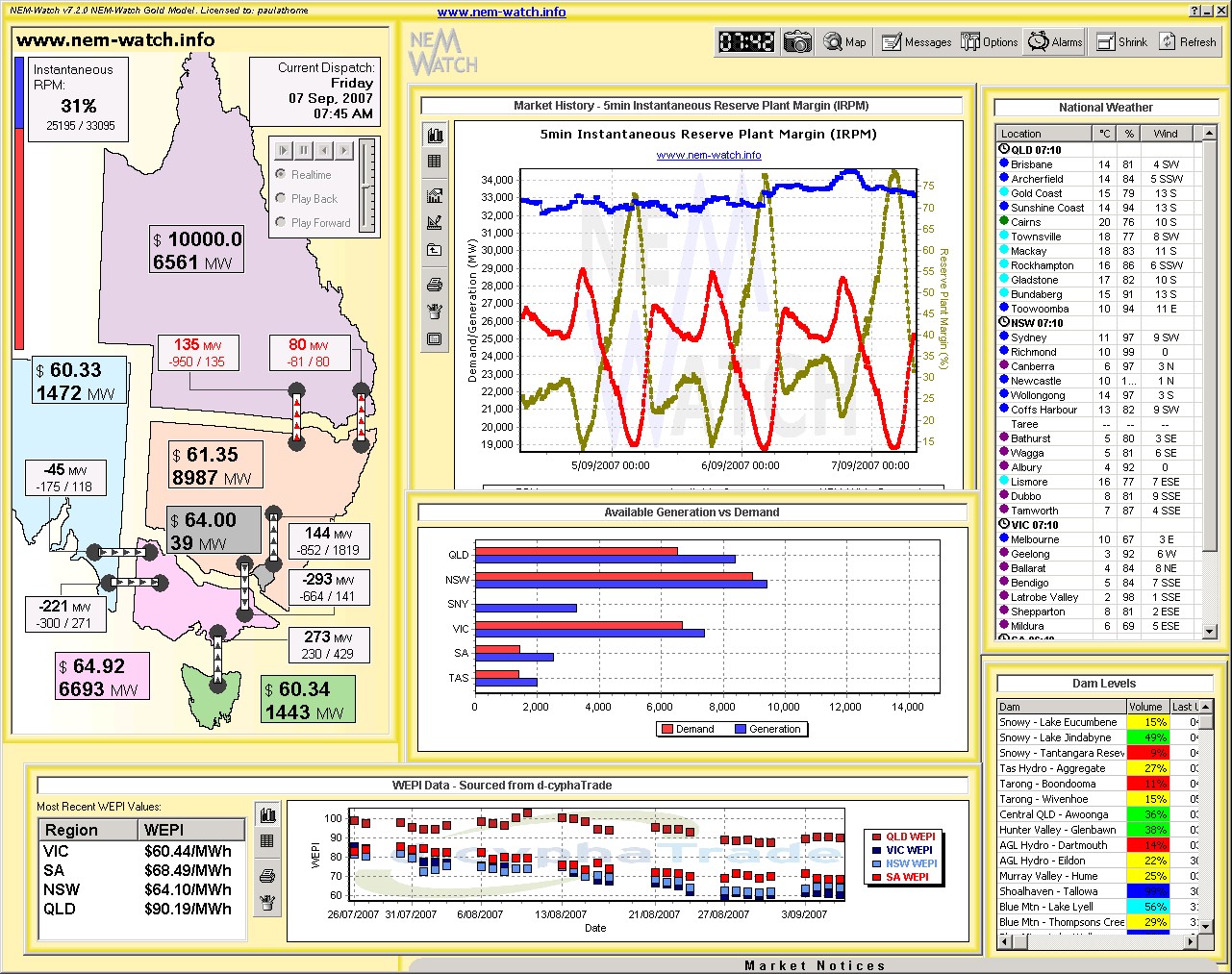
In addition to the general increase of the median prices that occurred in most months of 2007 (including September), we also see in the NEM-Review chart above two price spikes in QLD. We have included below a record of one of these – when the QLD dispatch price went to VOLL in the morning of Friday 7th September 2007. As can be seen, this occurred when QLD had in excess of 2,000MW of spare available generation capacity.
|
|
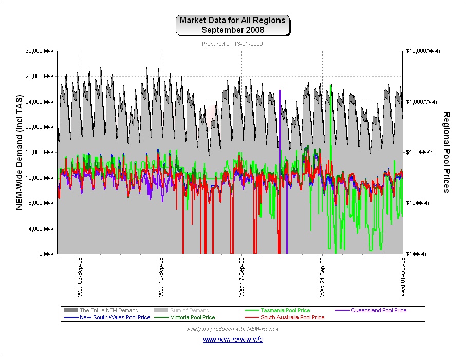
September 2008 |
Finally, we see that prices dropped from the high levels experienced in September 2007, but still remained higher than most of the other years in the 10-year sample. The reason for this can be seen in the chart from NEM-Review version 5.3 below:
|

Be the first to comment on "September in the NEM (a review of 10 years of history)"