
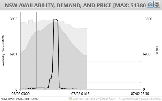
With the people of New South Wales facing yet another day of extreme heat, following a sweltering weekend, the likelihood of spot price volatility was always going to be high yesterday. Predispatch forecasts through the morning showed the possibility of a couple of hours of prices close to the Market Price Cap (MPC) of $14,000/MWh through the late afternoon peak demand period, as seen here in ez2view’s Summary Trends chart for NSW, “time travelled” to show the outlook at 9am AEST:
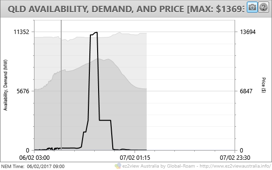
The outlook for Queensland, where summer heat and demand have just been uniformly strong, was for at least as much volatility:
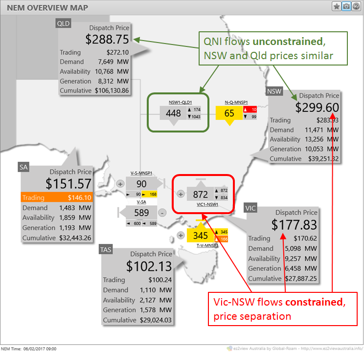
On a day with high demands in NSW as well as in Queensland, these two NEM regions are very likely to exhibit strongly correlated spot price behaviour, because:
- with two relatively high capacity and reliable interconnectors from adjoining states (the QNI link from Queensland and the Victorian interconnector), on days of high demand NSW typically relies on significant imports from both regions – this is evident in the first chart above which shows only a relatively small margin at the peak between demand (the darker grey area) and local generation availability (the lighter grey area). This narrow margin is supplemented by the capability of QNI (about 800-1000 MW southward capacity), and the Victorian link, although available capacity on the latter depends strongly on system conditions – as discussed in an earlier post.
- With Queensland demand also high, it is unlikely however that there will be so much “excess” low cost generation available in that state that the QNI link will actually constrain southward flows – after which the NSW spot price could move significantly higher than Queensland’s as AEMO needed to dispatch additional NSW generation to meet demand increases. Instead we are quite likely to see closely related prices in the two regions, with southward flows on QNI less than the full capacity of the interconnector.
By contrast, with subdued demands and plenty of spare generation in Victoria, northward flows in the Vic-NSW interconnector are much more likely to hit that interconnection’s export limits, resulting in significantly lower prices south of the border.
We can see these effects already operating at 09:00 in ez2view’s NEM Overview Map:
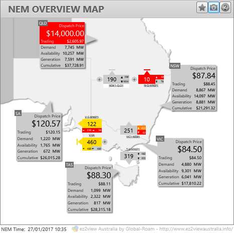
We’ve also seen many situations this summer when NSW has not faced extreme demands and the (much smaller) northward capability of the QNI interconnector has constrained flows from NSW into Queensland, leading to price spikes being isolated to Queensland, for example this one from Jan 27:
This feature of NSW and Queensland effectively operating as one large “Northern NEM” region yesterday is the key theme I wanted to draw attention to in this post, rather than a detailed investigation of the price spikes themselves, which would be a much longer story.
Skipping to the actual outcome of the day, I’ve plotted up NSW and Queensland 5 minute dispatch interval (DI) level prices and demands using ez2view’s ez2trend Time Series Data Viewer widget (still under development):
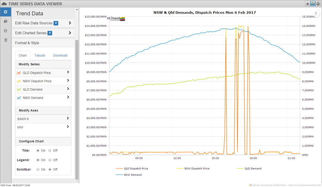
Here we see that:
- NSW and Queensland prices indeed moved closely together throughout the day;
- While significant, the volatility was less extended than earlier forecast in pre-dispatch (even though we didn’t appear to see previous levels of voluntary demand response in reaction to actual or threatened high prices, which can damp volatility).
Investigating the second point further would require more time and space than this post allows, but I’ll provide one more picture that may provide a clue as to why this was the case, via an ez2view NEM Overview snapshot, time travelled back to DI 16:45 which was just prior to the main block of volatility in the chart above:
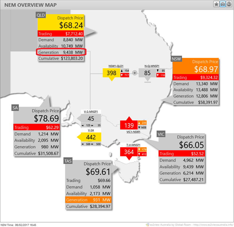
I’ve highlighted the level of Queensland generation above which is well into the mid-9000 MW level, given local scheduled demand of 8,840 MW and exports of nearly 500 MW south on the QNI and Directlink interconnectors. However the dispatch price of only $68.24/MWh must mean at least 9,400-odd MW of Queensland generation capacity was being offered at or below this price. We’ve frequently seen the bidstack in Queensland this summer such that 5 digit prices occur at significantly lower levels of generation dispatch (see here and here for examples). Why was yesterday different?
One possible reason – although I’m speculating – is that some Queensland generators had sold (financial) contracts to hedge counterparties against the NSW spot price in addition to their “natural” position of hedging the Queensland price. In these circumstances, if prices in both regions move together like yesterday, those generators would have a strong financial incentive to offer more volume at low prices – to ensure being dispatched – than they might on days when the NSW spot price was not likely to spike.
 |
Allan O’Neil has worked in Australia’s wholesale energy markets since their creation in the mid-1990’s, in trading, risk management, forecasting and analytical roles with major NEM electricity and gas retail and generation companies.
He is now an independent energy markets consultant, working with clients on projects across a spectrum of wholesale, retail, electricity and gas issues. You can view Allan’s LinkedIn profile here. Allan will be regularly reviewing market events here on WattClarity. Allan has also begun providing an on-site educational service covering how spot prices are set in the NEM, and other important aspects of the physical electricity market – further details here. |
Be the first to comment on "Overview: NSW & Qld Price Volatility, Monday 6 Feb 2017"