On Tuesday we posted about how the NEM-wide demand maxed out at such a low level that it would have seemed ludicrous had you suggested that to anyone 5 or 6 years ago. That NEM-wide peak occurred on 22nd January, the day on which AusNet Services had declared a Critical Peak Demand Day for their distribution patch within Victoria.
Weeks earlier (on 2nd January) as assistance to our keen competition entrants, I’d posted these thoughts about what might be expected for the Victorian peak demand for this summer.
Hence it was with interest that we progressed to investigating the Victorian demand in this post, to see the details of what happened over summer 2014-15.
Having seen (from prior years) that NEM-wide peaks often accompany peaks in Victoria and South Australia, and knowing the NEM-wide peak was low, I was expecting a low Victorian peak (but I was still surprised by what I found).
1) What actually eventuated?
That wasn’t the only reason I expected Victorian peak demand to be low.
Having run NEM-Watch in our office for situational awareness over the course of this summer period, I had already been aware that this was a low-demand summer in Victoria – there had been plenty of green, and even blue colours observed (being down the bottom end of the historically-derived colour-scaling).
In fact, I really can’t remember seeing anything “hotter” than light green in Victoria.
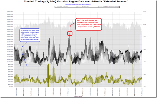
This feeling was validated after crunching this summer’s stats and determining that Victorian demand made it only as high as a 8,638MW peak (and that this peak was actually at 15:55 NEM time on 22nd January 2015).
Wow, that’s about 1,600MW lower than the peak demand achieved last year – and almost 1,900MW lower than the all-time record!
For your reference, the trend over the four-month “Extended Summer” is shown in the following snapshot from NEM-Review:
As noted on the image, there were only 2 days where demand peaked above 8,000MW (the 22nd January and the 7th January) and surprisingly few where demand even peaked above 7,000MW!
2) How well was this expected?
This summer, in conjunction with our traditional “main prize”, we also offered to give away a “consolation prize” for the closest to the market at guesstimating what the peak demand would be for the Victorian region (this was Competition #4 of a total of 7 competitions this summer).
2a) Was it expected, by our competition entrants?
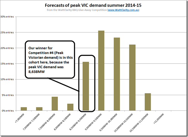
Collating all the entries and plotting a distribution, we see this pattern:
As we can see, the actual demand peak sat towards the bottom end of where the bulk of the entries landed – hence there were definitely some entrants who thought that Victorian demand might be as lacklustre as it turned out to be – and some considerably lower, as well.
However, the majority of votes were for demand in between the actual level and up to the prior maximum experienced back in 2008-09 (a record which came close to being eclipsed last summer).
SO WHO WINS THE “CONSOLATION” PRIZE FOR COMPETITION #4 (VIC PEAK) THIS SUMMER?
One person who can now be enjoying their new portable BBQ prize, from Barbeques Galore, is revealed here…
It’s always easier, in hindsight, to rationalise why such a big proportion of our entrants missed the boat on getting anywhere near what the peak demand ended up being.
2b) Was it expected, by AEMO?
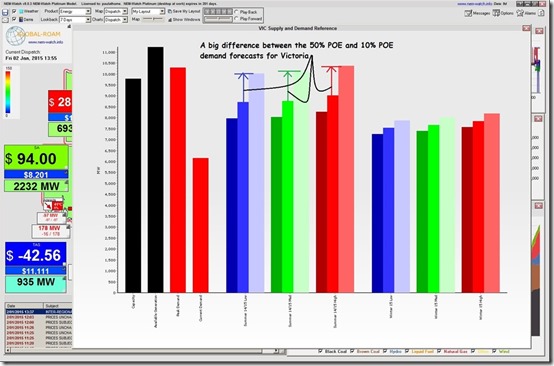
Back on 2nd January, when I posted these tips for entrants to competition #4, I included a snapshot from NEM-Watch highlighting what the AEMO had said about what peak demand might be under the 3 different economic development scenarios, and the three different weather permutations.
For ease of reference, here’s that image again:
Just eye-balling this chart, it does appear that the actual demand peak of 8,638MW is in the vicinity of what the AEMO forecasted under a 50% POE (probability of exceedence) scenario.
Hence, in summary, not really a surprise.
Whilst on the topic of the above chart, note the big difference highlighted between the 50% and 10% POE predictions – we’ll come back to that below…
3) Looking in more detail?
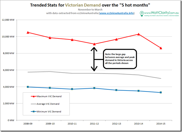
Firstly (as we did with our analysis of NEM-wide demand), we include a trend of the headline stats. From this we can see how the peak this past summer is the lowest it’s been in Victoria in (at least) the past 7 summers:
We can also see the significant drop from the previous summer, which we suspect is primarily weather-related.
Note, in this chart, the large gap between peak and average demand (and that there’s also a large gap between the 10% POE and 50% POE predictions by AEMO, shown above). These reflect the “peaky” nature of Victorian demand, in relation to some other regions – more on that in the coming days…
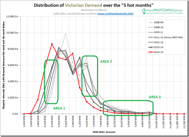
Delving into more detail, we’ve extracted the relevant data and produced the following distribution chart, looking at the 5-minute dispatch intervals:
When results are presented in this way, a number of specific changes are very evident.
3a) Closure of Point Henry smelter
As previously noted on this site (by our guest author, Paul Taliangis) the closure of Point Henry aluminium smelter had a significant effect on Victorian demand. Note, in this post, that the consumption at Point Henry started declining in 2013-13, though the closure did not occur until August 2014.
This can be clearly seen in the shift of minimum demands (highlighted in area 1 on the chart above) – beginning several years earlier, but with the major shift in 2014-15 (with the closure in August 2014 there’s no consumption measured for Point Henry in the chart above.
3b) The effect of solar not as pronounced in Victoria
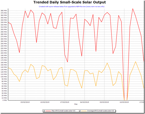
One of the other points that can be noted (in Area 2) is that the effect of solar is not quite as marked, given the lower impact of solar in Victoria (compared to the boom-region of Queensland, for instance – more on that when we come to Queensland).
Using the limited range of small-scale solar production history we’ve saved into a pre-release beta of a future NEM-Review upgrade, we see that the APVI small-scale solar data for Victoria trends as follows:
[please excuse the data glitch there for 2 days – it is a pre-release beta, after all]
3c) Peak demand there last year, not this year
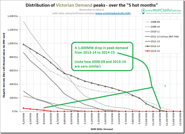
Also noteworthy is how (in Area 3) we see the peak demand that threatened to break the record in summer 2013-14 evaporate entirely in summer 2014-15.
Using the same method as we did for NEM-wide demand earlier (zooming in on the peak demand level, and flipping the chart to cumulative) we see this very clearly:
Keep in mind, as well, that the 1,000 dispatch interval amount of demand above 8,200MW* that’s been there in 4 of the past 7 years shown equates to 83 hours – or less than 4 days in total (again, a challenging proposition to cater for).
Also keep in mind that in 2 years there were fewer intervals above 8,200MW – but that the peak demand did still stretch:
1) up to 9,624MW – 1,400MW above 8,200MW* for 16 lonely hours in 2010-11; and
2) up to 9,110MW – 900MW above 8,200MW* for about the same number of cumulative hours in 2011-12.* note that we chose 8,200MW arbitrarily as the place to start the x-axis, but the story is largely the same no matter what starting point we choose at the top end.
Hence, in summary, Victorian peak demand:
1) occurs for only a couple of days each year,
2) at a level that’s more 4,000MW higher than average demand,
3) is higher some years and much lower other years (with a spread in the past 7 of almost 2,000MW),
4) that current technology (like demand response and solar PV) are only partially successful in addressing (refer here),
5) hence is a very expensive challenge that’s not going away, and still needs to be catered for.Coincidentally I noted yesterday in the new Energy White Paper, hot off the press, (on p11) that it notes:
“Peak use has been constant over time despite the overall reductions in demand, …”
Well, looking at the last chart above, it’s clear that peak demand has been far from the same (year-on-year) – though it has certainly been a constant challenge, made even worse, perhaps, by the unpredictability of its extremes.
As with all regions, we will watch with interest to see what happens in Victoria, moving forwards.


Leave a comment