One thing we’ve been puzzling about for a while (and which was topical back on 2nd July, for instance) is the degree to which diversity of wind patterns across the NEM mean that wind supplies (collectively) can be counted on more than would be the case for an individual project.
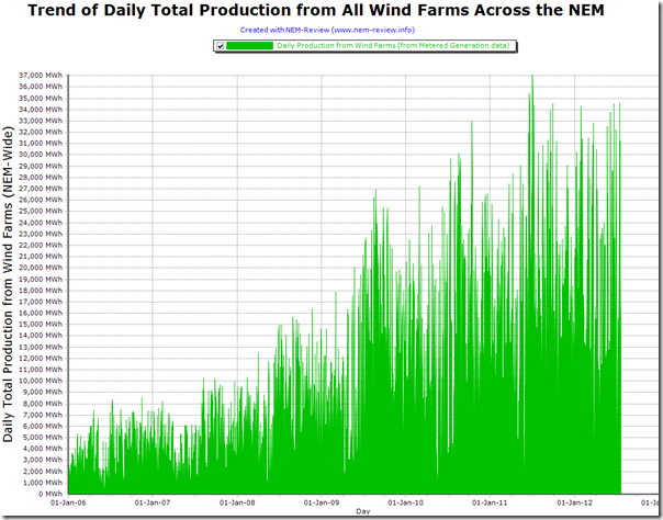
The following chart from NEM-Review has been produced to highlight daily total wind supplies from all wind turbines across the NEM for which the AEMO has published metered generation data (defined here).
From this chart, we can clearly see the upwards trend in energy produced from wind over the years since January 2006.
We can also see how the median daily production volumes appear to be approximately 30%-40% of the peaks – and that these median levels are fairly consistently reached. However we can also see a few random days (not all that often) when total production volumes dropped much lower than those median levels (down towards 0MWh for the day).
Will have more of a look, when we have more time…


It’s not difficult to see why wind is only given a capacity credit of under 10% – often much lower.
Thanks Martin
There’s some interesting charts of the European (UK and Spanish) context of the correlation of wind production across multiple sites in this report here:
http://escornwall.com.au/index.php/2011/05/jonathan-dennis-final-report/
Paul
Yes please take the time! This looks interesting. Are the peaks actually maximum NEM wind capacity?
It’d be good to also understand it on a state by state level to perhaps see how dependent it is on regional weather patterns.
Thanks Adam
I will put this on the “things to do” list and return to it when I can.
I suspect that reducing to individual states (or other areas) will highlight a greater individual variation of output from various wind farms.
Paul
What would be a great addition to the graph would be a line showing the operational capacity (the theoretical maximum that the bars are falling short of). At the moment the temptation is to guess it as the envelope of the peaks; but that ain’t necessarily so.
Also plotting the generation data as bars makes it hard to see how much low-generation there is. Could the same data be plotted as just points?
Thanks Jon
Will make a note to do both of the above, when we have a chance to return to this analysis.
Regards
Paul