The Carbon Tax came into effect two weeks ago (on Sunday 1st July 2012) – and since that time we’ve posted several pieces of analysis on WattClarity.
As a result of both, we’ve fielded a number of questions from a wide range of people (clients and others) which seem to resolve to the following three general concerns:
Question 1) Has the jump in prices been entirely a result of the Carbon Tax?
Some people have phrased this along the lines of “are the generators over-recovering the cost of the Carbon Tax in how they are bidding into the market?” whilst others have been primarily concerned with the effects of the compensation that is being paid, in tranches, to selected generators
Question 2) Is what we’re seeing now, in terms of the distribution of dispatch prices across every day, the “new normal”?
This has been particularly a concern for a number of large Energy Users who are clients of ours.
Question 3) What physical outcomes have been observed, to date, coincident with the introduction of the Carbon Tax?
Some have had a particular focus on particular power stations, whilst others have been more interested in the market as a whole (e.g. whether or not the overall level of emissions has changed perceptibly).
As time permits, we’ll look at how we can answer these questions (and others we might receive in future). Here’s a few starting notes…
1) About the step change in prices
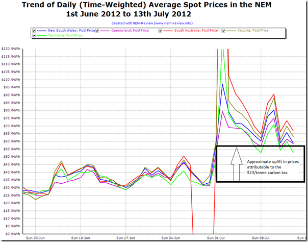
In the following chart generated from NEM-Review, we highlight the daily time-weighted average prices over the past 45 days:
In the chart, we can clearly see that, as expected, prices have shifted upwards.
We’ve marked on this chart what might be expected with a full pass-through of a $23/tonne carbon tax into spot prices – though it should be noted that this is only approximate, because of a range of different factors including the different carbon intensities of plant around the NEM, and the different dispatch patterns the change in cost structure delivers.
Aside from the obvious spike on Monday 2nd July (analysed previously here) we can see that the uplift in prices is somewhat in line with what was expected to be the case. However, it is understandable that there will still be questions asked, such as those noted above.
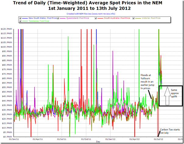
If we “zoom out” on the chart above (of daily average prices) to highlight trend of daily average prices over a longer time horizon (1st January 2011 selected as a random quarter start date) we can see more of the noise that is typical of prices in the NEM, by virtue of the large number of interrelated factors* at play in every 5-minute dispatch interval:
* for instance – over 200 units each submitting up to 10 tiered bids into the market, subject to roughly 500 individual constraints invoked at any given time, produces significant complexity
As noted on the chart, we can see an earlier shift in prices (June 2012) when we saw floods at the Yallourn coal supplies significantly reducing the output of the station (a situation which still continues).
This is just one of a large number of variables that has contributed to the volatility and trends in pricing seen in the chart above. As can be seen in the noise, to try to reduce “cause and effect” to a single factor is difficult.
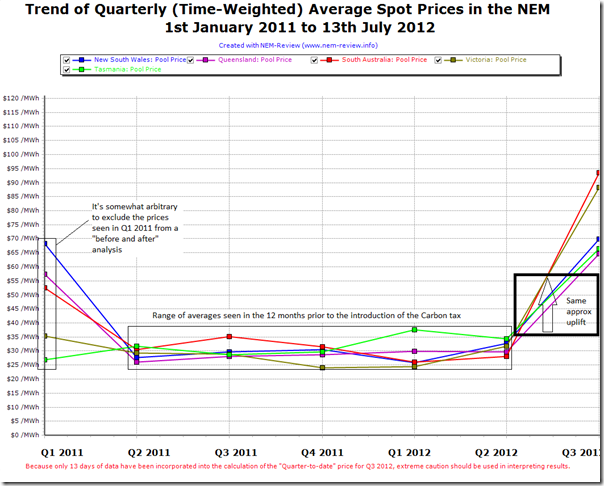
Aggregating this data up to a quarterly time-weighted average does help to remove some of this noise – though it’s still too early to draw conclusions with respect to the pricing questions above.
2) About generation changes
It was with interest that we read this month’s electricity update from Pitts & Sherry. With the use of NEM-Review, Pitts & Sherry have highlighted the downward trend on aggregate emissions (and emissions intensity) as a result of the declining level of demand* across the NEM.
* Note that the Pitts & Sherry update talks about the steady fall in demand seen across the NEM over the past couple of years, which we’ve also previously analysed in a series of posts, such as this one, where we list a significant number of factors all contributing to the decline .
Through further analysis, they highlight how it has been the black coal generators which have been bearing the burden of the declining demand, through reductions in output (particularly the Eraring, Munmorah, Liddell and Vales Point stations in NSW)
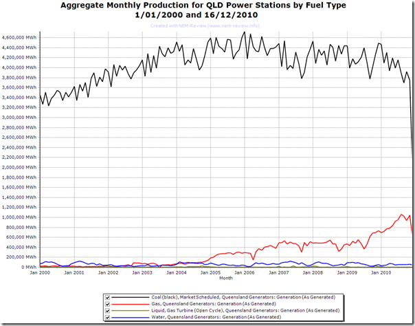
Interesting, in this chart we produced from NEM-Review back in 2010, we showed how output from QLD black coal generators had already been reducing, partly as a result of the State Government’s 13% gas scheme:
The message in these prior pieces of analysis (as it relates to the Carbon Tax) is that there have been changes already working through the market, so it’s useful to assess any changes in the generation patterns (from 1st July onwards) in the light of these pre-existing trends.
It was also with interest we read these comments on RenewEconomy, and in particular the somewhat startling claim about Origin’s Darling Downs power station:
“But gas has found itself squeezed out by a limp carbon policy and falling energy demand. Its 630MW Darling Downs combined cycle gas fired generator, for instance, the cleanest baseload generator in the country, is running at less than half capacity just two years after it was built.”
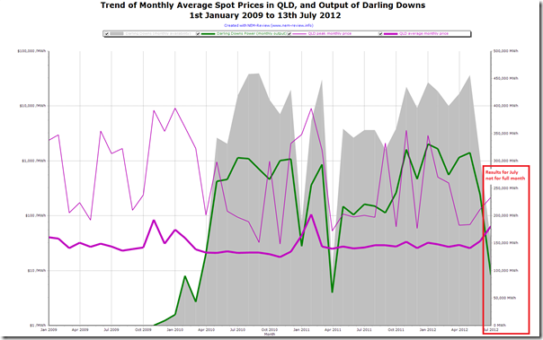
To further investigate, we produced this trend of output and available capacity from NEM-Review:
With a registered capacity of 644MW, the theoretical maximum monthly output of the station would be approximately 460,000MWh – but from the chart above we can see that the availability of the station has rarely reached this level.
The station availability of the station calculates out at 77% over the period since May 2010, which appears to be when the station completed its initial commissioning schedule and was available for regular service.
This availability is lower than we expected. We have not had time to investigate what physical issues the station might have been experiencing to lead to this unavailability.
Further, we see that the output has been below full capacity for much of the period when it has been running. Average utilisation calculates at 70% across all the months the station has been operational since November 2009.
We have not investigated what generation portfolio reasons Origin might have had for running Darling Downs at lower than a 100% utilisation, or whether the operational choices made by Origin at the station are linked to Origin’s positions on the APLNG project, or whether there have been external (transmission or other) constraints that might have meant output could not have been higher.
Hence it does appear that output from Darling Downs is down (though not less than half) – and whilst lower demand and higher renewables from an expanded RET and attractive solar subsidies would be playing a role, it’s also apparent that other issues might be at play as well.
We don’t have more time for analysis today – but will return to these broader questions as time permits in the weeks ahead. If you’d like to suggest other questions, give us a call on 07 3368 4064.


Paul
Thanks again for another insight into the changes. With respect to the downturn in generation, we Engineers often overlook the economic perspective of cost elasticity of demand. The first time I was reminded of this was back in the 1980’s when NSW introduced the first inverted tariff. Fifty or so years of increasing public electricity use (thanks to price decreases) suddenly stopped!
That could clearly be part of what is happening now and, if cost (Carbon plus regulated costs) is a larger component than we expect, the downturn could accelerate. Not a win for renewables necessarily, but a win for energy efficiency and conservation.
Thanks Peter,
As you imply, reductions in demand due to higher costs could be significant – and could well be more significant than the effect of embedded generation of any type.
Will look into this further, at some stage.
Paul