To provide further context to a longer-term view of how prices have trended in the 16 years since the competitive electricity market has been introduced in Australia (discussed here) I highlighted (below) some further analysis of the way the shape of prices has varied from year-to-year (keep in mind that the results shown for 2010 are until 21 July 2010 only).
A. Queensland Region
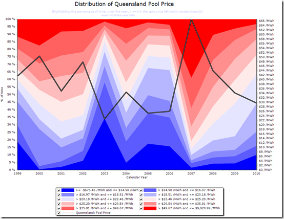
The following chart is generated in NEM-Review 6 and provides a colourful view of the way in which the distribution in prices across each calendar year has trended across the 11.5 years of NEM history.
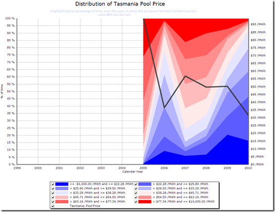
Each of the 10 colour bands highlight a percentage of time over the year (or part-year in the case of 2010) that the price had fallen in that band. The ranges within the bands are calculated automatically to provide the clearest colour graduations.
For QLD, we can see how the years in which the annual average spot price was low generally display a high instance of prices below $30/MWh. We can also see how 2007 delivered a markedly different distribution in prices, because of the impact of the drought across the NEM.
B. NSW Region
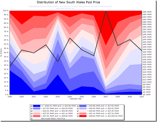
The following chart is the same chart, generated for the NSW region.
By comparing the chart for NSW with the one for QLD above we can see how the pattern has many similarities – with perhaps the greatest differences being in the early years (when interconnection with QLD was non-existent, or weak).
C. VIC Region
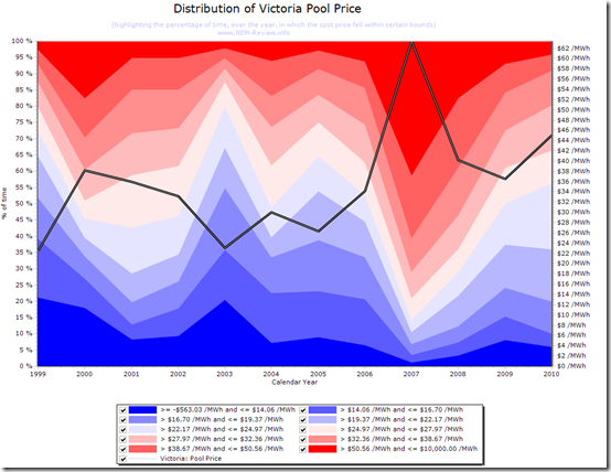
A similar chart is included for Victoria.
Because of the large size of the interconnector between VIC and NSW, the pattern of prices is seen to be very similar between these regions.
D. SA Region
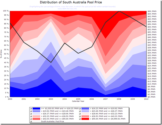
A similar chart is included for South Australia.
This chart shows some significant differences to the pattern seen for Victoria above. However, the underlying trend remains the same.
E. TAS Region
Tasmania only joined the NEM in mid-2005 – hence the chart below is more truncated.
| For those who wish to perform additional analysis with the data shown here, we have uploaded the .NRF file to this location. Just download the linked file, unzip, and double-click to open in NEM-Review 6 – then enjoy! |  |


Be the first to comment on "Historical Distributions in Spot Prices"