
As reported in Bloomberg, NSW experienced a record summer demand on Thursday 15th January, driven by high temperatures across the state.
The extreme weather experienced in NSW followed the extreme weather that swept across South Australia and Victoria only two days beforehand.
By our reckoning, the peak experienced in NSW was only about 900MW from the peak all-time demand experienced in NSW on Monday 28th July 2008 – coincident with staggering record set for NEM-wide demand.
We don’t have a load of time to look in detail, but have quickly thrown together this chronological review of what happened on the day. This sequence shows a number of snapshots taken from version 8 of NEM-Watch. With respect to these snapshots, please note the following:
- Two different versions are featured:
- version 8.1, which is the current public release of the version, and
- version 8.1.1 which is being tested internally, and incorporates (amongst other things) suggestions for improvement our clients have made with respect to version 8.1.
- The version number (for your reference) is shown at the top of each display.
- New to version 8, the geographical display utilises colour-coding of regions, and price boxes, to make the relative levels of demand and price more intuitively obvious even at a distance from the display:
- Demand is coloured from blue (recent historical minimum) to red (all-time maximum) demand for the region;
- Price boxes are coloured from blue ($0/MWh) to red ($150/MWh) – in the current version, this is a step-wise graduation, though this is being changed to be a sliding scale to provide greater clarity.
- Additionally, version 8 (Gold and Platinum) illustrates consideration of Economic Islands, and the local reserve plant margin available within each of these. When IRPM for an economic island is low, this is highlighted to make it obvious to the viewer.
- All times shown in the NEM-Watch display are shown in NEM time (i.e. Australian Eastern Standard Time, without daylight savings). One exception is with respect to weather data, which is shown in the respective local time of the measurement point (as provided by the Bureau of Meteorology).
|
Sequence of events on Thursday 15th January 2009 |
|
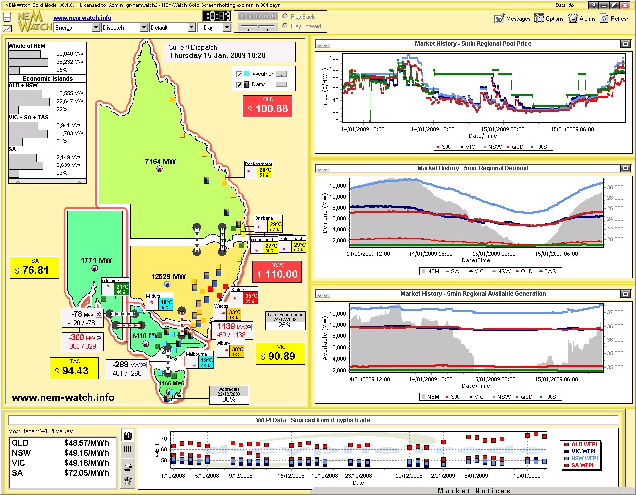
Our first snapshot on the day was taken at 10:20 (NEM time) to highlight that the temperature in Sydney had already reached 35 degrees. Even at that point in time, we can see (through the colour-coding of the regions) that NSW was experiencing relatively higher demand than was the case in VIC and SA – in complete contrast to what we had seen 2 days prior. |
|
|
|
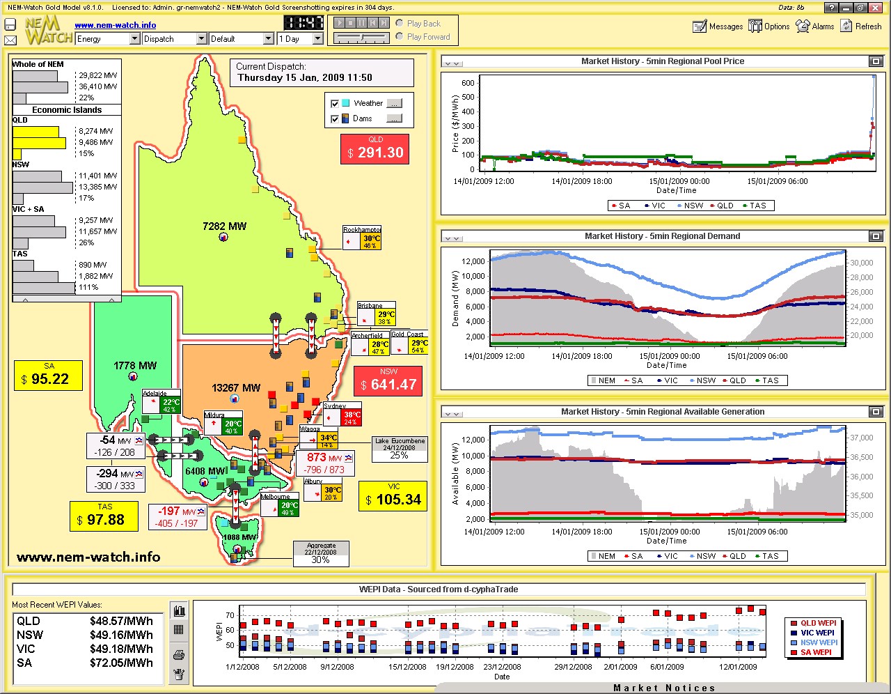
Only 90 minutes later (at 11:50) we see that the heat had spread across more of the state (more red dots, especially concentrated in the main load center of Newcastle-Sydney-Wollongong). In response, the dispatch demand target in NSW had climbed by 750MW to be 13,267MW. Prices in NSW had begun to climb. |
|
|
|
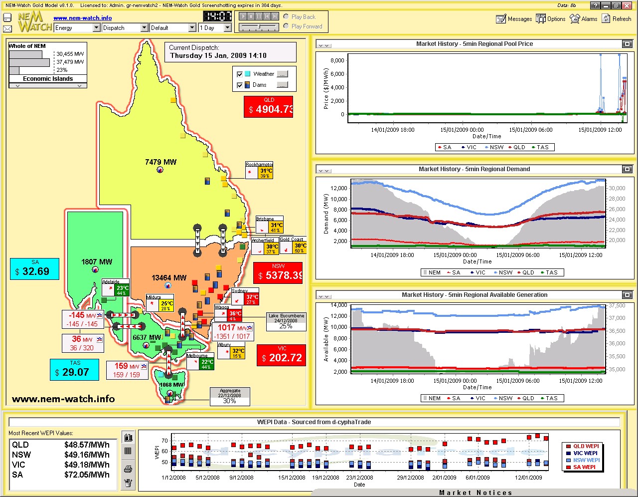
At this point in time, we see four Economic Islands in action:
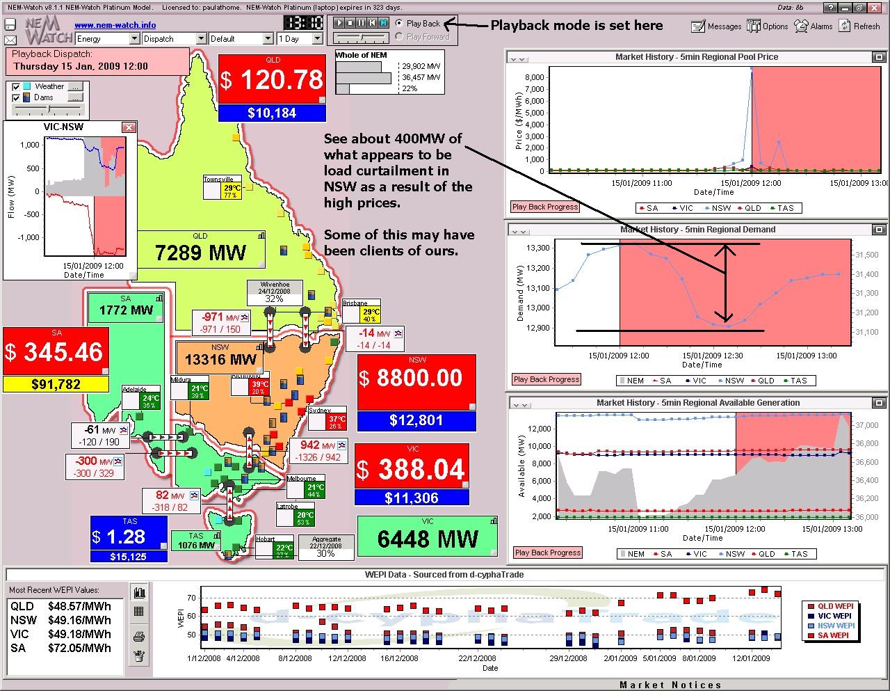
In the next snapshot, we used the Playback Mode to review what had happened in the market at 12:00 (when the price first jumped to $8800/MWh in NSW – triggering the of several SMS alerts we received on the day). |
|
|
|
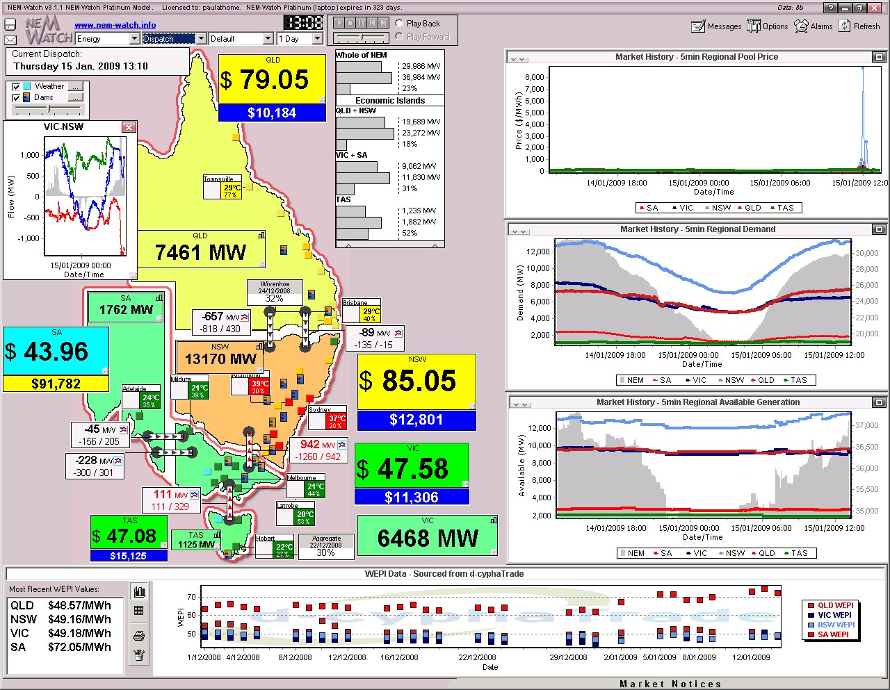
By 13:10 (70 minutes later), we see that prices had subsided below $100/MWh again. At that time, we see NEM-wide demand was edging close to 30,000MW (certainly not close to what we’d expect the peak NEM demand to be this summer). We can also see that the price spike (of only short duration) had done little to budge the Cumulative Price indicator off its low level for NSW – unlike what can be seen for SA currently, as a result of the prolonged spike of Tuesday. |
|
|
|
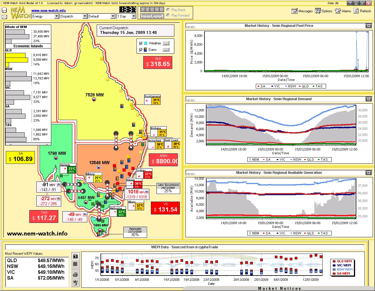
At 13:40, we see that prices had spiked in NSW again – this would have been partly due to the rise in demand over the 30 minute period between snapshots. |
|
|
|
As can be seen (by the red dots on the map, marking cities with temperatures at 35 degrees or above) the hot weather had progressed further across the state by this time. At this time, we can see that the NSW dispatch demand target had reached 13,548MW, close to the quoted NEMMCO figure of 13,581MW (at around 14:00, NEM time) for the new summer maximum.
|
|
|
|
At 13:45, we see the QNI interconnector un-constrain – resulting in QLD prices jumping, and NSW prices falling. The QLD+NSW Economic Island so created is shown to have a 14% local IRPM. |
|
|
|
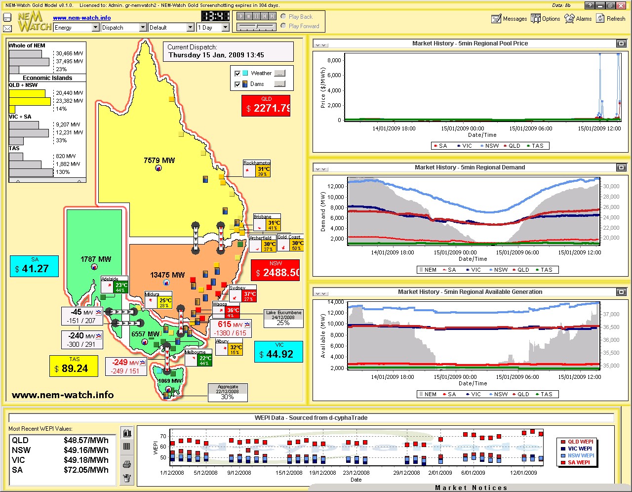
Five minutes later (at 13:50) we see (above) that the demand had kicked up again in NSW (by about 50MW over 5 minutes). |
|
|
|
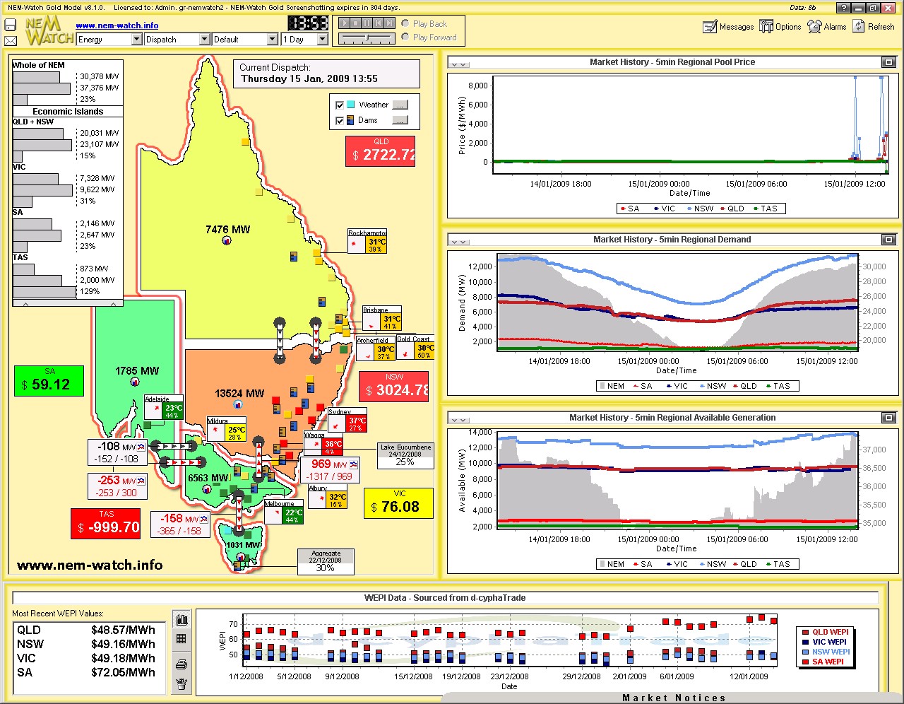
Five minutes subsequently (at 13:55) we see (above) a similar situation, with NSW demand slightly higher than 5 minutes beforehand. Note the negative prices in TAS – presumably as a result of constraints on the way Basslink was required to import into TAS (see between 13:50 and 13:55 imports to TAS fell by about 270MW – this has not been investigated further). |
|
|
|
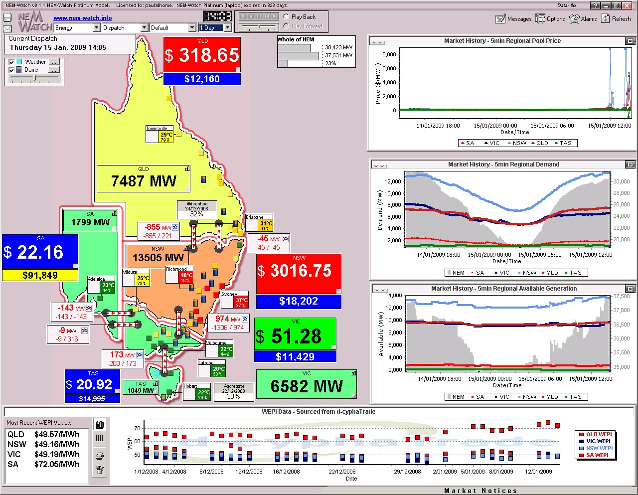
We missed taking a snapshot at 14:00, but the 14:05 snapshot (above) shows that, 10 minutes after the previous, demand in NSW had started to drop. Note that, throughout this day, the colour of the VIC and SA regions barely changed off the light green colour (representative of moderate demand), as a result of the moderate temperatures experienced in the south and mid-west. As shown in the image above, it really was a case of 3 distinctly different weather patterns across the NEM. |
|
|
|
At 14:10 (5 minutes later) we see (above) that QNI had un-bound again, resulting in a jump in prices within QLD. The IRPM window was minimised in this screenshot. |
|
|
|
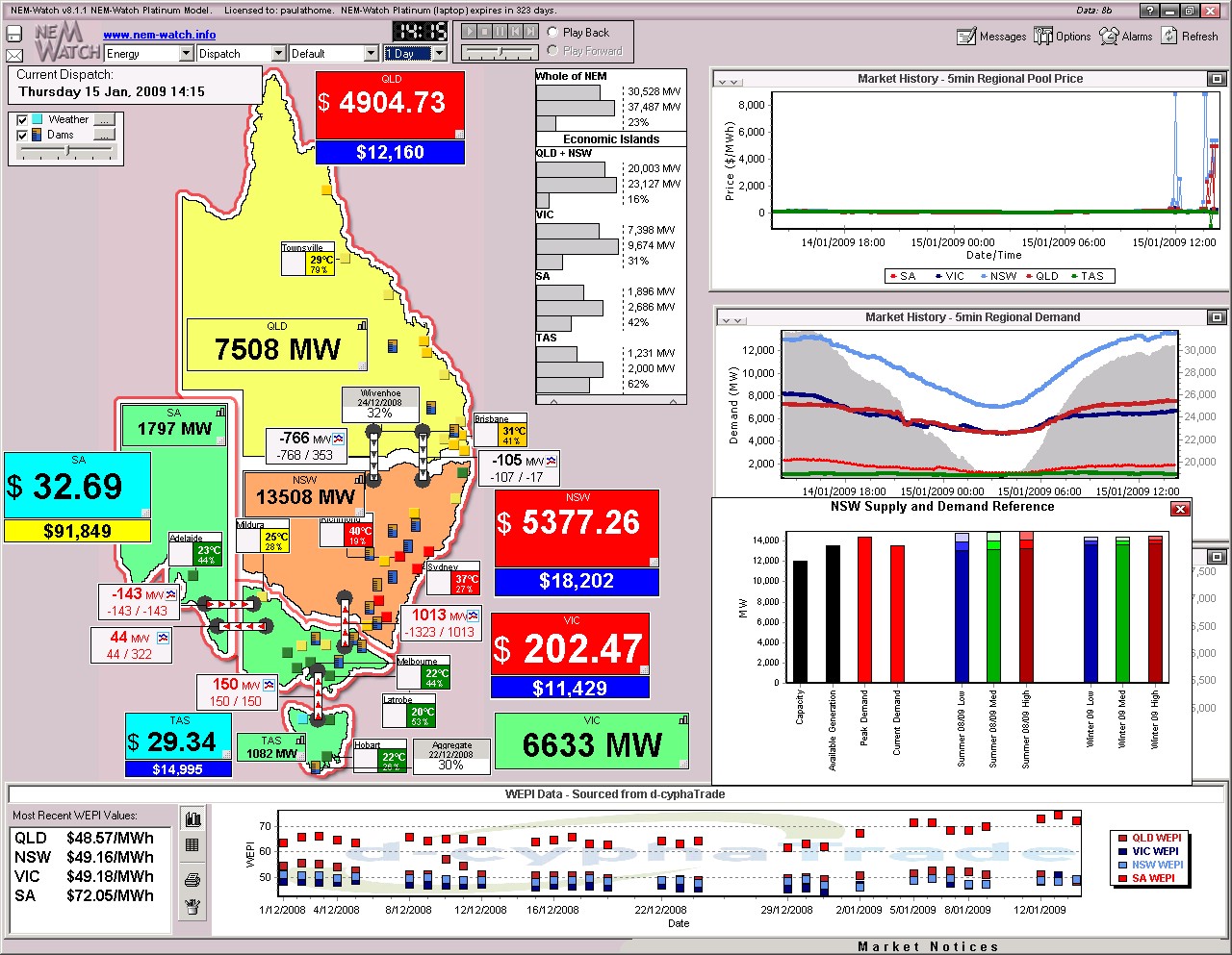
At 14:15 (a further 5 minutes) we see a similar story. In this snapshot, we have included the “NSW Supply and Demand Reference” chart, which is useful for comparing how the current demand in NSW compares against both:
|
|
|
|
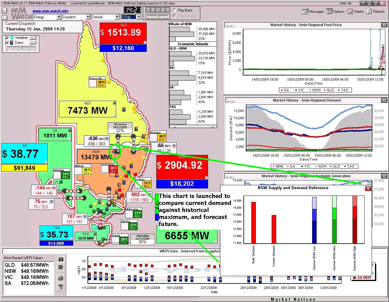
At 14:20 (5 minutes later) we see that demand had dropped slightly in NSW (by about 30MW) and prices had backed away slightly as well. The “Supply and Demand Reference” chart is zoomed-in, to allow you to see the detail.
|
|
|
|
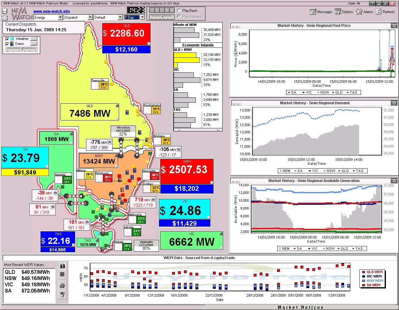
At 14:25, we can see that the NEM-Wide demand was hovering around 30,459MW. Prices in QLD+NSW were still high, given the constraints on VIC-NSW prevented any more cheap power from being imported from the south. At this time, we see that the temperature in Sydney had reduced markedly, so it was not surprising to see demand fall away into the afternoon and evening. |
|
|
|
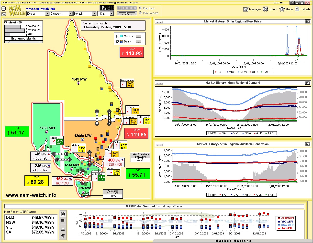
At 15:30 (65 minutes later) we see Sydney temperatures had fallen further, bringing with them a decrease in demand. Prices had subsided as well. |
|
|
|
By 16:05, we see (in the zoomed-in “5 min Regional Demand Chart”) demand clearly on the decline (within NSW, and NEM-wide). |
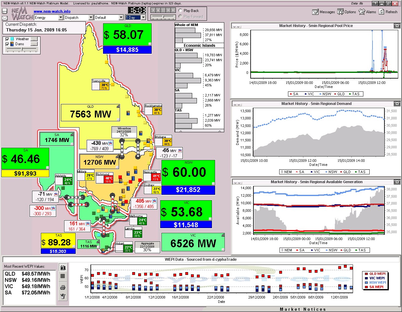
Unlike the analysis we included for the events of two days earlier, we don’t have the time at present to look at how each NSW generator performed over the day – but you could do this yourself, with your own copy of NEM-Review (even on a trial for 2 weeks).
Be the first to comment on "Record summer demand in NSW yesterday!"