
1) The NEM reaches 10
For those who are unaware, 13th December 2008 marked the 10th Anniversary of the inception of the NEM. We released a short review of NEM history on that day to commemorate.
Given the occasion, however, we thought it would be useful to have a look, in more detail, at what has happened over the past 10 years.
Taking a slightly different approach, we’ve opted to review each month at a time – hence, this is one of twelve articles posted on this site at the same time.
2) 10 years of June
Through the NEM-Review software, we have prepared this illustration of how (average and peak) NEM-Wide Demand for electricity has grown over the past 10 years.
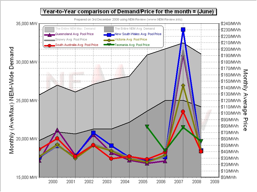
With respect to this chart, two things in particular need to be noted:
- Tasmania only joined the NEM in mid-May 2005 – hence the data for June 2005 shows the effects of Tasmanian region demand for the first time.
- The measure of “demand” calculated in NEM-Review v5.3 is the (30-minute) Trading Demand Target, which is the time-weighted average of the (5-minute) Dispatch Demand Targets over the half hour:
- Hence, the demand shown here is an output from NEMMCO’s NEM-DE (Dispatch Engine) and not a metered demand. In most cases, the numbers will be very similar, but they will vary from figures quoted elsewhere for “maximum demand”
- This is further explained in the glossary on the NEM-Review portal.
3) Quick Links
As the following table is quite lengthy, we’ve included here Quick Links to each of the 10 years included in the table below:
- June 1999;
- June 2000;
- June 2001;
- June 2002;
- June 2003;
- June 2004;
- June 2005 (including Tasmania for the first time, from mid-June);
- June 2006;
- June 2007;
- June 2008
4) Each Year at a time
In the following table, we touch on the highlights of some of the June months that have passed, since the creation of the NEM.
|
June 1999 |
As highlighted in the diagram above, June 1999 saw modest prices in all regions. |
|
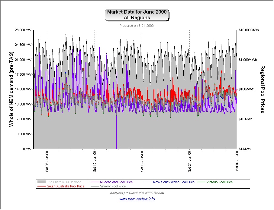
June 2000 |
The main chart (above) illustrates that prices rose in all regions -particularly QLD. This can be understood, at least in part, because of the rise in (average and peak) demand across the NEM. It is noteworthy to see that the average price in QLD was higher than in the other regions – the following chart (generated in NEM-Review version 5.3) illustrates why this was the case.
It is interesting to note that:
|
|
June 2001 |
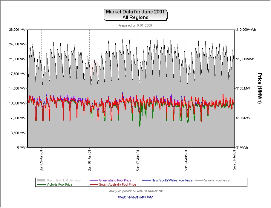
June 2001 saw prices subside in all regions from their levels in June 2000. The following chart (generated in NEM-Review version 5.3) demonstrates clearly why this is the case:
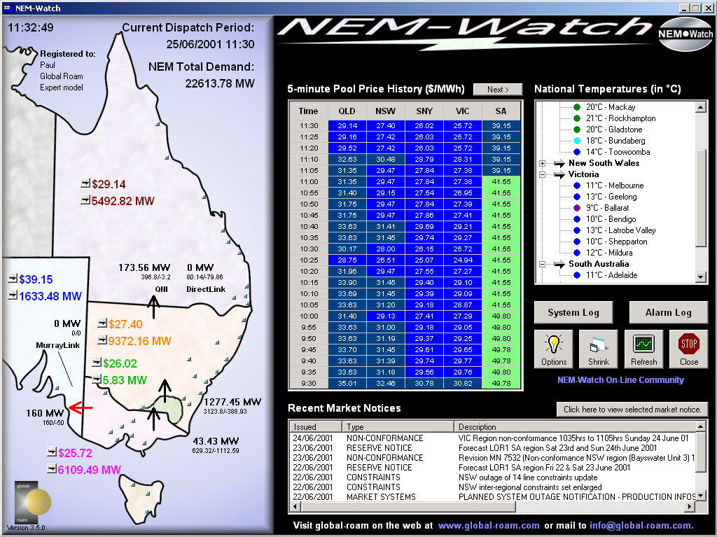
As can be seen, there was not a single price over $100/MWh in the month of June 2001 (in any region) – truly remarkable! Purely for interest’s sake, we have included the following snapshot of one of the 30 “boring” days in the market that occurred over June 2000 (as shown in NEM-Watch version 3):
The above diagram shows a de-rating on the transmission capacity between VIC and SA (over the Heywood AC link). Normally, the capacity would be 500MW, but on this occasion, the capacity has been reduced to only 160MW. We have not taken the time to investigate, but are aware that it may have been due to lightning activity. |
|
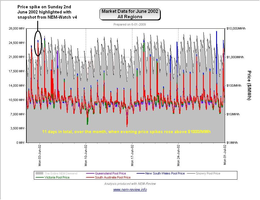
June 2002 |
June 2002 saw a substantial rise in average prices, for all regions. We have previously prepared a more lengthy analysis of this issue – however the following chart (analogous to those above) clearly demonstrates the difference: In summary, what emerged in winter 2002 was the wide-spread employment of a tactic that has become known by several terms:
Essentially, generators took advantage of a predictable spike in demand around 18:00 and 18:30 each evening, and changed their offers to the market (pricing some of their capacity more expensively in the knowledge that, on most occasions, it would still need to be dispatched). Hence, generators engineered higher prices for winter peaks in demand – which offered them some relief from the many months of low prices they suffered prior to June 2002. This pattern can be clearly seen in the following chart (drawn with NEM-Review version 5.3), highlighting that evening price spikes were a common occurrence in June 2002;
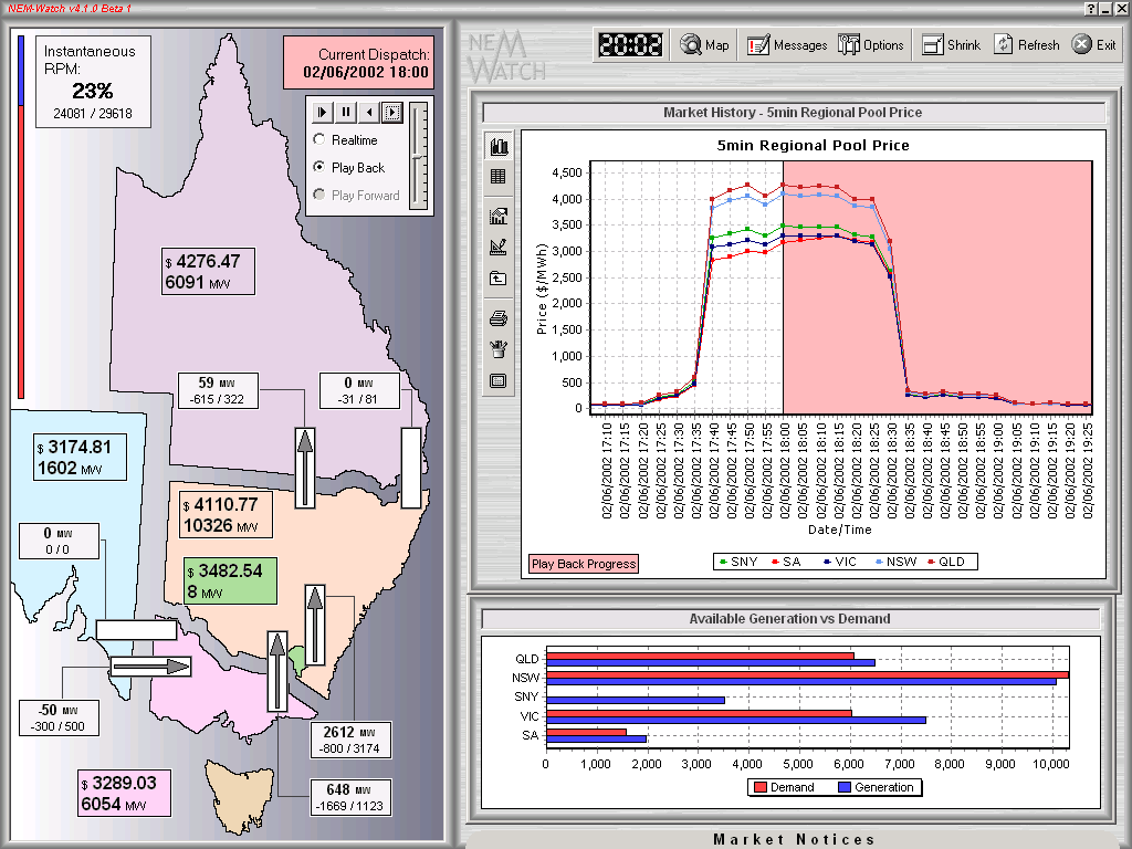
The following snapshot (Playback of Sunday 2nd June 2002, taken from NEM-Watch version 4) illustrates one of the many instances over winter 2002 when these high prices were engineered.
|
|
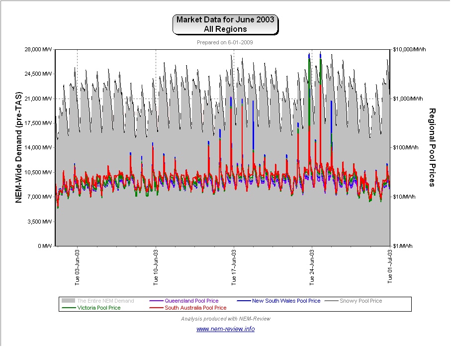
June 2003 |
As noted in the chart above, prices were lower across all regions in June 2003 (marginally higher in NSW). As shown in the following chart (drawn with NEM-Review version 5.3), there was a much lower incidence of volatility in the market compared to the previous June.
|
|
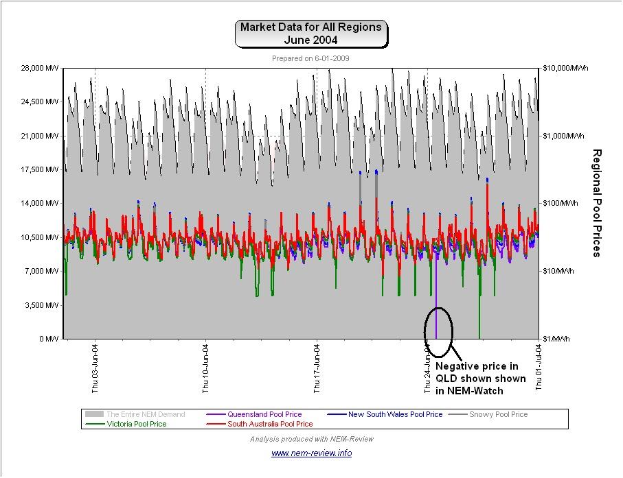
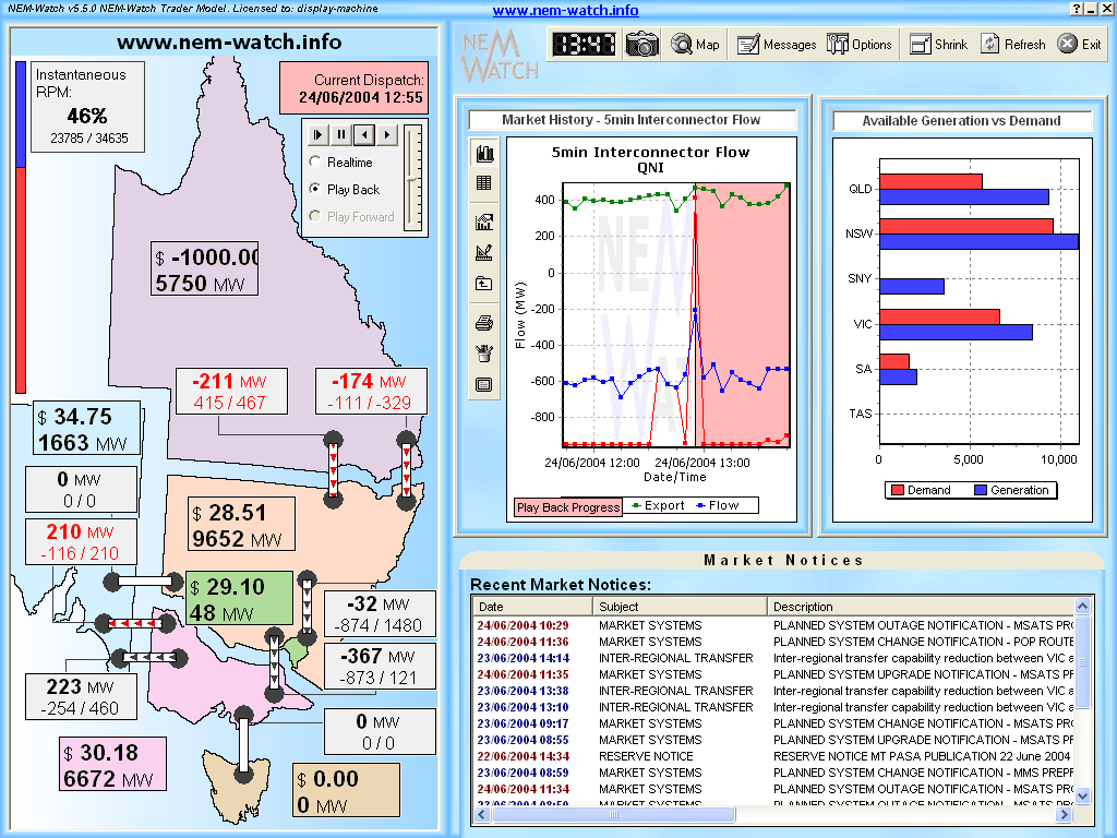
June 2004 |
As shown in the main chart (above) prices in June 2004 were lower than in previous years.
The NEM-Review chart (shown above) highlights the reason why prices were subdued (very few price spikes). Out of interest, we have included the following snapshot (taken from NEM-Watch version 5) showing the 12:55 dispatch interval on Thursday 24th June:
We have not investigated this issue in more detail. |
|
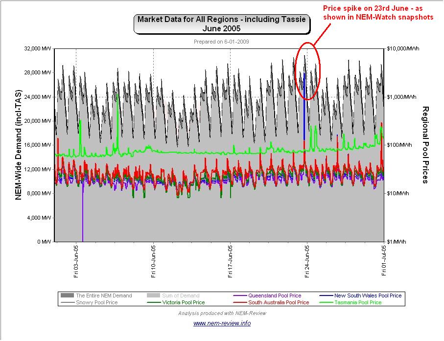
June 2005 |
As noted in the chart above, prices were amazingly low across all regions in June 2005. The following chart from NEM-Review highlights how there was an almost complete absence of volatility (except for a price spike on Thursday 23rd June 2005, when NSW and QLD prices rose above $1000/MW):
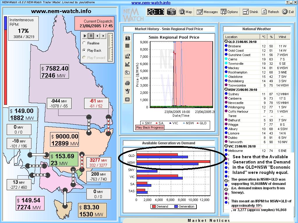
Note that Tasmania is shown in these June charts for the first time in June 2005. For comparability, the “Mainland NEM” demand is also shown. Tasmanian prices can be seen to be completely independent to the mainland – as Basslink was not operational at that time. The price spike on 23rd June 2005 is highlighted in the following snapshot (taken from NEM-Watch version 5, using the playback feature):
At 17:45 that day, we see that prices in QLD and NSW had jumped, and yet prices remained moderate in the south (because the SNOWY-NSW interconnector was running at constraint). As noted on the image, a quick review of the numbers reveals that the IRPM of the QLD+NSW Economic Island implies an IRPM of approximately 19%, as compared with an actual IRPM across the NEM of 17%. Because of the possible error in reading available generation of the graph, we can say that they were virtually the same. Hence, it is seen that QLD+NSW had no more shortage of generation capacity than did the rest of the NEM, and yet prices had spiked much higher. This would seem to imply another case of “Economic Withholding of Capacity” delivering high prices in the north.
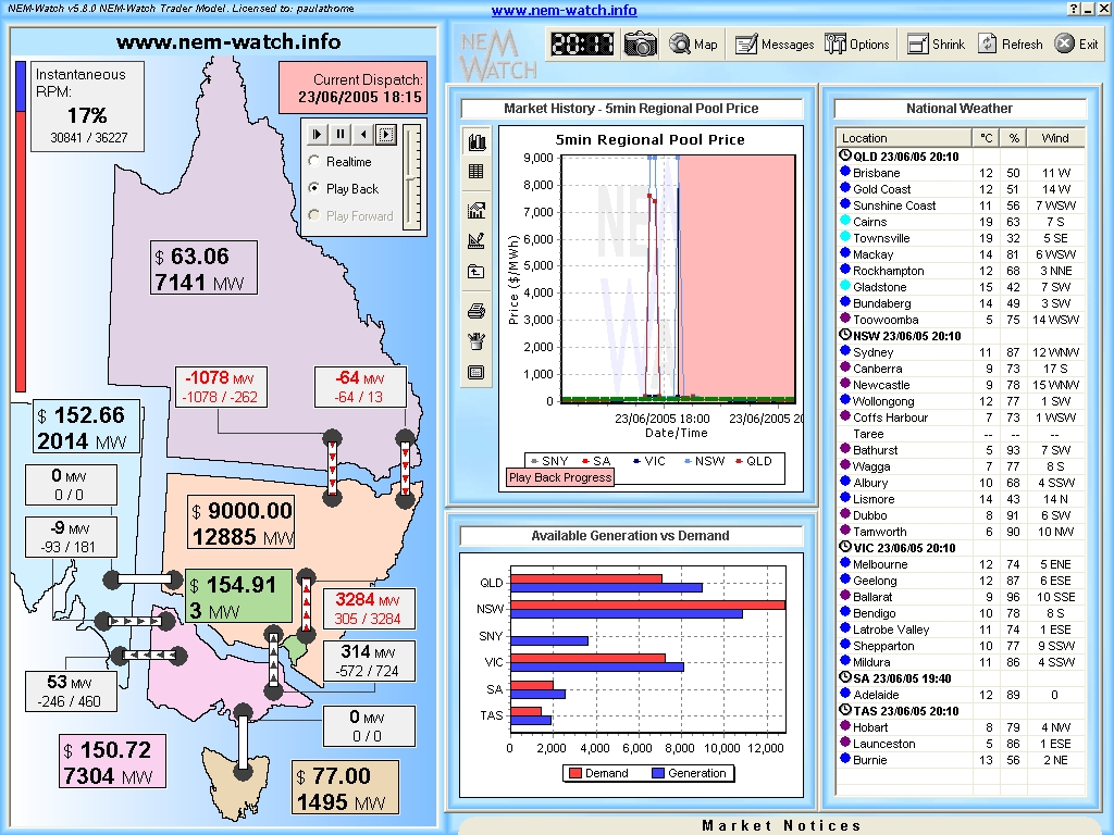
30 minutes later (at 18:15) we see a second case of the price spiking – however in this instance, it is only NSW prices that spike (because in this instance, QNI was also constrained). In this case, we can calculate that there was 8,459MW of demand in NSW being served by NSW-based generation (the rest by imports from QLD and SNO). It appears (though it’s difficult to read) that there was about 11,000MW of generation available at the time in NSW. Hence this implies an IRPM in the NSW Economic Island of approximately 30% at the time: These types of situations are much easier to view, in real-time, through the integration of live display of “Economic Islands” into NEM-Watch version 8. |
|
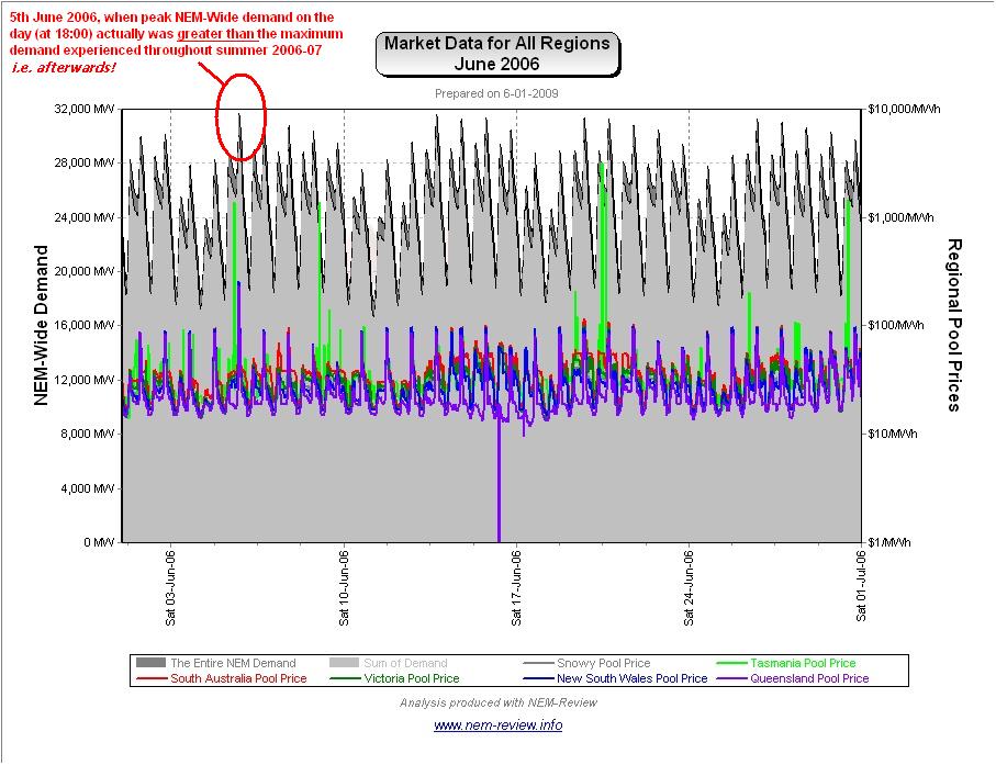
June 2006 |
As the main chart above shows, June 2006 showed slightly increased prices in all mainland regions – with prices in Tasmania converging on the mainland (given the commissioning of Basslink earlier in the year).
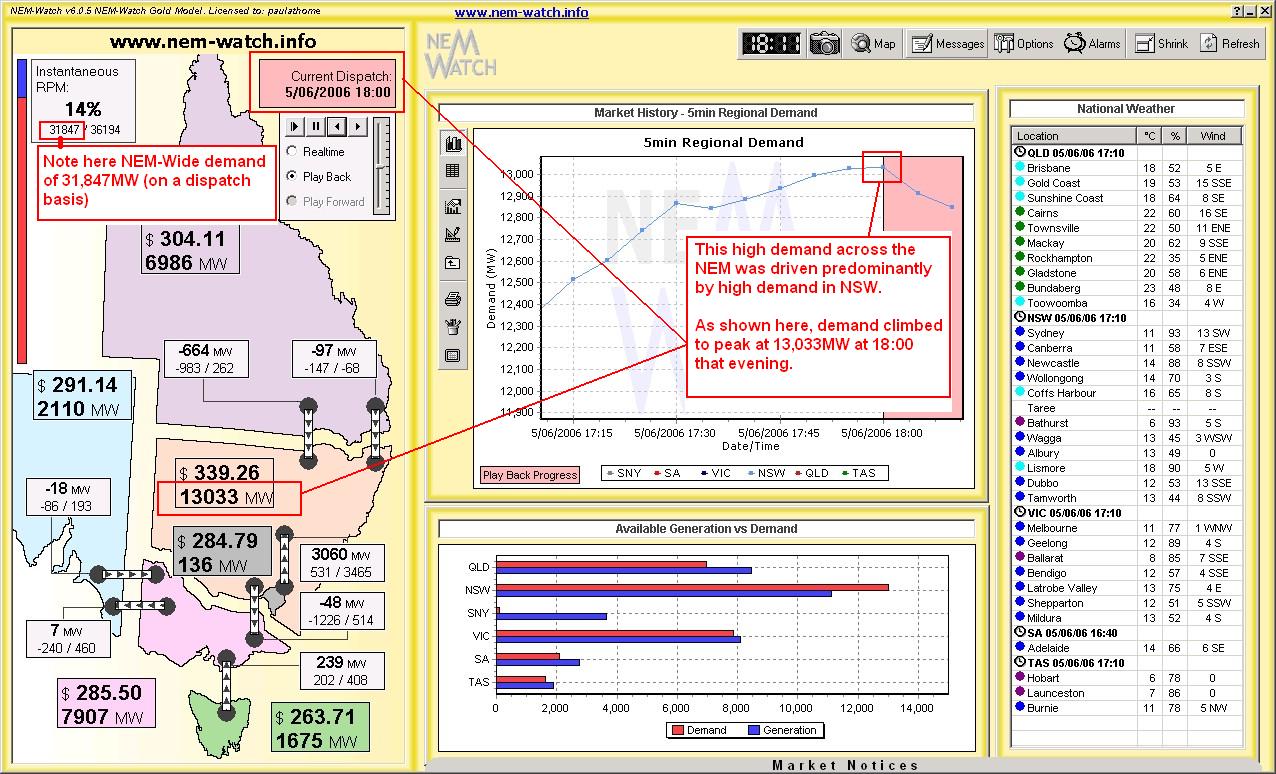
From the above NEM-Review chart, we can clearly see why prices in TAS averaged somewhat higher than the other regions. The following snapshot (taken from NEM-Watch version 6) shows playback of the 18:00 dispatch interval, highlighting a high demand period across the NEM.
Keep in mind that the peak NEM-wide demand for summer 2006-07 we have already shown to be 31,843MW, hence this demand spike shown here was 6 months earlier than the peak for summer 2006-07, and actually 4MW higher than the highest demand experienced the following summer. We’ve heard a lot about the NEM being a summer-peaking market increasingly in the future (i.e. where demand in summer is higher than demand in winter), but this would serve to illustrate that it does not always work out that way! |
|
June 2007 |
As shown in the main chart (above), average prices in June 2007 were absolutely huge! Our review for April highlighted the reasons why the drought meant 2007 was a unique year, amongst the 10 years of NEM history to date. The drought goes to explain some of what is shown in the chart for June 2007, below (produced from NEM-Review version 5.3 below).
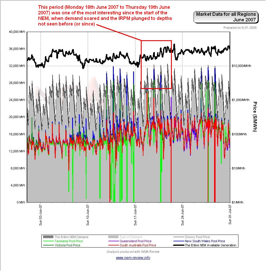
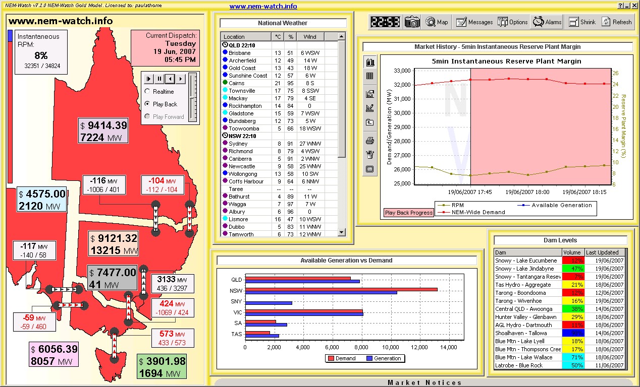
However, there was far more of interest in June 2007 than just the drought. As can be seen from the diagram above, there was a large incidence of negative prices over the month (particularly in Tasmania, but also in other regions). The lower bound of the chart has been suppressed to facilitate a log scale. As shown in the highlighted section on the image above, the week from Monday 18th June 2007 was possibly the most interesting week in the last 520 weeks of NEM history. This week is shown, in further detail, below.
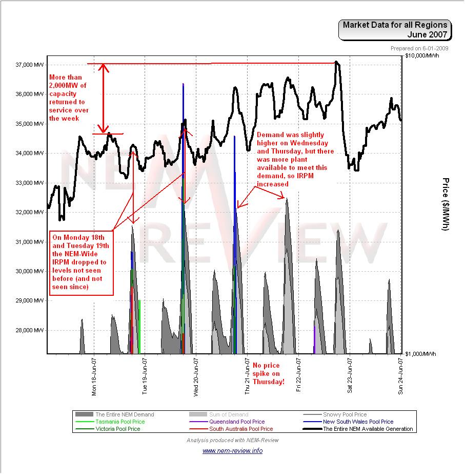
As can be seen from the chart, demand grew over the week – with evening peak demand being above 32,000MW on Tuesday, Wednesday and Thursday in the week. Because there was a greater amount of capacity unavailable earlier in the week, the NEM-Wide IRPM plunged to its lowest level ever (a low of 7.6% at 17:45 on Tuesday 19th June 2007). At this time, the NEM had just 2,473MW of “spare” capacity available. The following snapshot (showing playback from NEM-Watch version 7) shows this clearly, along with the massive prices experienced, right across the NEM, as a result.
We have already completed analysis which showed the historical significance of those two evenings of extremely low IRPM on 18th and 19th June 2007. |
|
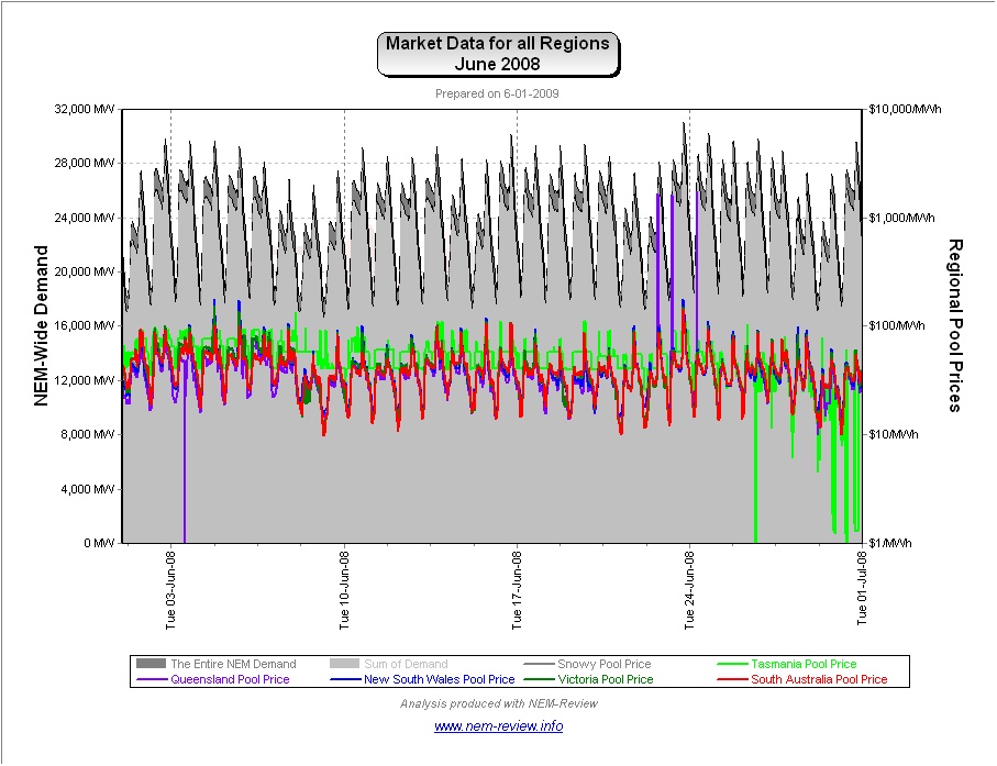
June 2008 |
Finally, we see that prices subsided from their June 2007 high a year later (in June 2008). The reason for the subsidence (little volatility plus the return of the price shape to more “normal” levels) can be seen in the chart from NEM-Review version 5.3 below:
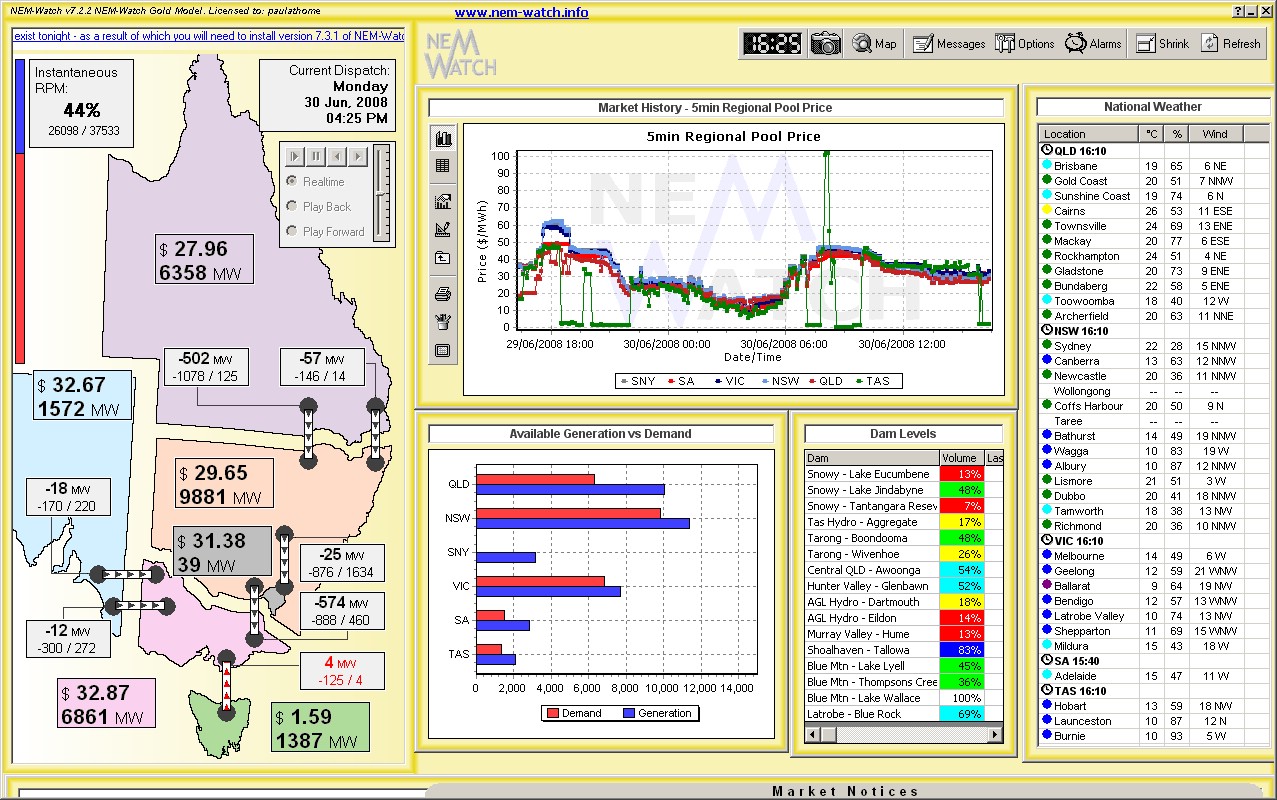
For the nostalgic, we have included below, to finish this review, one of the last snapshots taken from NEM-Watch before the end of the Snowy region.
From 1st July 2008, the Snowy region ceased to exist, with generators formerly in the Snowy region assigned to the NSW and VIC regions. |
Leave a comment