
1) Summary
Just as had been forecast, Tuesday 13th January 2009 saw hot, dry weather roll in across South Australia, and then into Victoria.
The high temperatures caused demand to climb, but not to the level at which NEMMCO had forecast demand to climb over the summer period.
As a result (but possibly including other factors) we saw the price in SA jump to a level near VOLL at 13:40, and remain there until about 18:00 (i.e. more than 4 hours). This substantial price spike resulted in the Cumulative Price climbing to $90,000/MWh (i.e. well on the way to price caps being imposed).
We hear more high temperatures are forecast for next Monday…
2) Contents
1) Summary
2) Contents
3) Sequence of Events
4) Later Analysis
(a) Torrens Island
(b) Pelican Point
(c) Northern & Playford
3) Sequence of Events
The following is a loose chronological record of the way we saw the day proceed.
This sequence shows a number of snapshots taken from version 8 of NEM-Watch. With respect to these snapshots, please note the following:
- Two different versions are featured:
- version 8.1, which is the current public release of the version, and
- version 8.1.1 which is being tested internally, and incorporates (amongst other things) suggestions for improvement our clients have made with respect to version 8.1.
- The version number (for your reference) is shown at the top of each display.
- New to version 8, the geographical display utilises colour-coding of regions, and price boxes, to make the relative levels of demand and price more intuitively obvious even at a distance from the display:
- Demand is coloured from blue (recent historical minimum) to red (all-time maximum) demand for the region;
- Price boxes are coloured from blue ($0/MWh) to red ($150/MWh) – in the current version, this is a step-wise graduation, though this is being changed to be a sliding scale to provide greater clarity.
- Additionally, version 8 (Gold and Platinum) illustrates consideration of Economic Islands, and the local reserve plant margin available within each of these. When IRPM for an economic island is low, this is highlighted to make it obvious to the viewer.
- All times shown in the NEM-Watch display are shown in NEM time (i.e. Australian Eastern Standard Time, without daylight savings). One exception is with respect to weather data, which is shown in the respective local time of the measurement point (as provided by the Bureau of Meteorology).
|
Sequence of events on Tuesday 13th January 2009 |
|
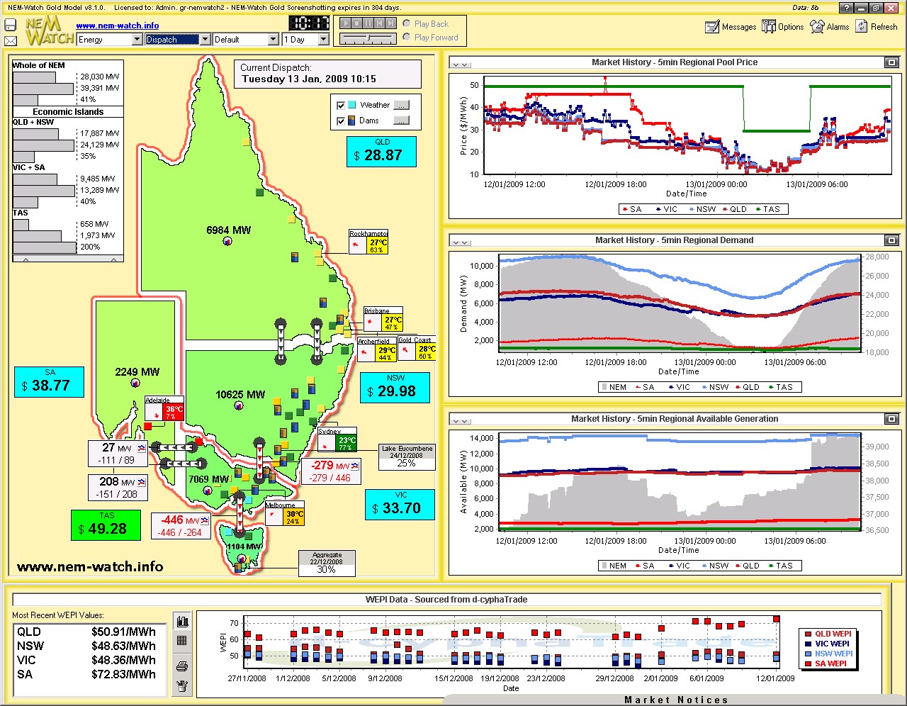
At 10:15 we see the temperature in Adelaide had already reached 36 degrees. |
|
|
|
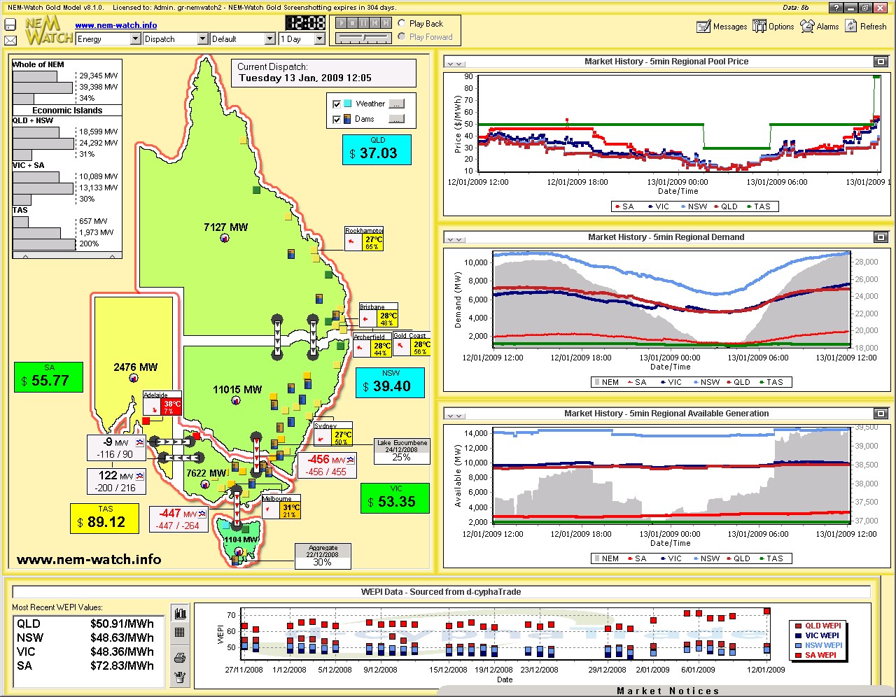
At this time, demand levels across all regions were in their respective mid-ranges (the light green colour) and prices were modest. Almost 2 hours later (at 12:05), and we see that the market had not changed too markedly – the temperature in Adelaide had continued to climb to 38 degrees, whilst the demand in SA had grown by another 225MW, making it higher (in relative terms) then the demand in the other regions (which were still cooler). |
|
|
|
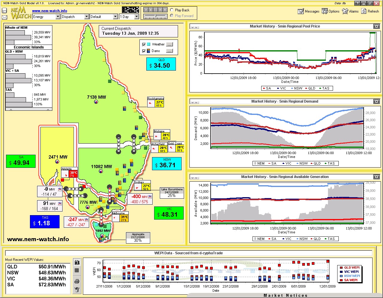
At this point in time, we see three Economic Islands in action:
By 12:35 we see that prices in TAS had dropped, coincident with a reduction in imports from VIC (despite the price difference, however, Basslink was still forced to flow south due to the technical limitations of the way the transmission line interacts with the Tasmanian region). |
|
|
|
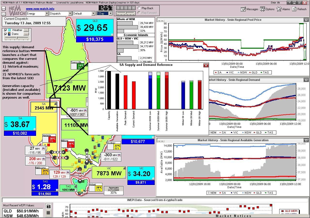
By 12:55 (below), the demand in South Australia had grown further (to 2545MW), which (as shown in the “Supply and Demand Reference” chart), was still some way from the peak demand forecast for summer 2008-09 under the 9 different scenarios published in NEMMCO’s 2008 Statement of Opportunities (SOO). |
|
|
|
By 13:05, we see that the price had jumped somewhat in SA (to $301.98/MWh) in conjunction with a further increase in demand to 2564MW. At this point in time, there were only 2 Economic Islands present:
At this point, it should also be noted that the rolling 7-day Cumulative Price in South Australia was at the level of $10,032/MWh (as shown in the display).
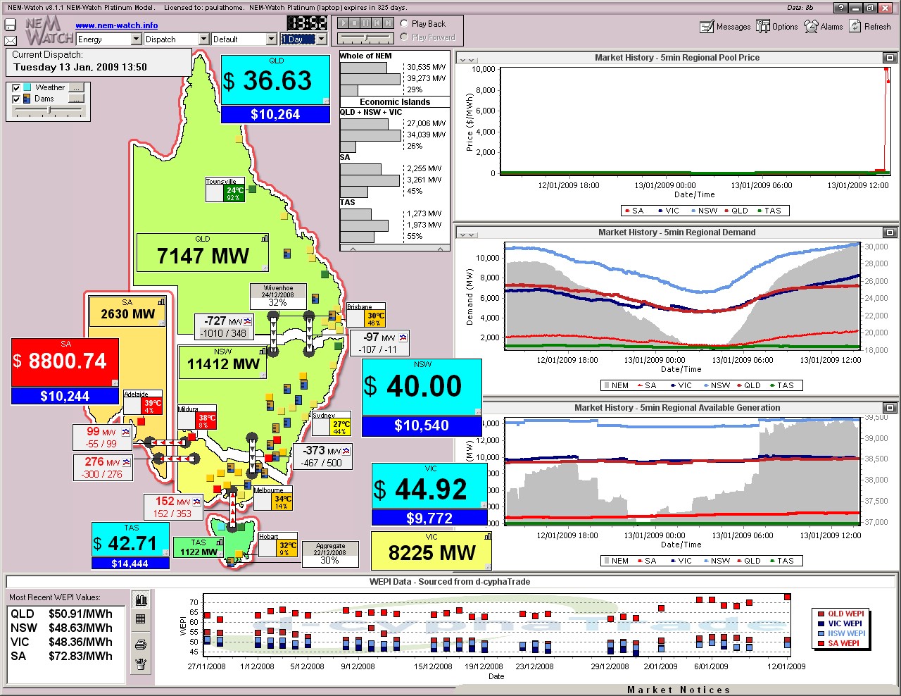
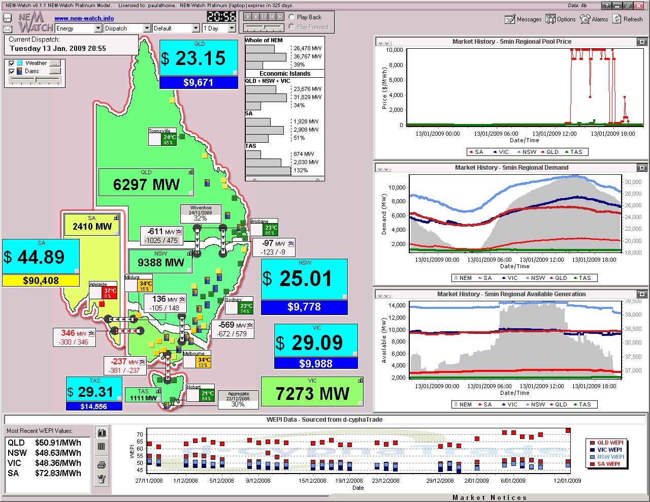
At 13:40, the price in SA jumped close to VOLL. We did not take a snapshot of the market at the time. We do, however, have a snapshot of the market 10 minutes later – when prices had reduced somewhat in SA (to $8800.74/MWh). |
|
|
|
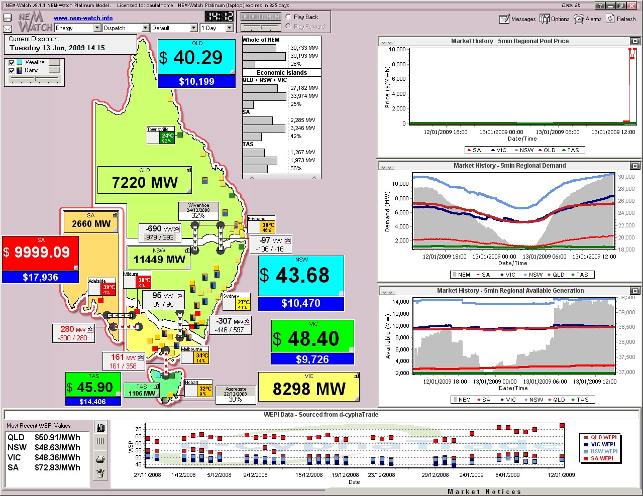
As can be seen (by the red dots on the map, marking cities with temperatures at 35 degrees or above) the hot weather had progressed further east by this time, raising the level of demand in VIC, as well. By 14:15 (25 minutes later) we see prices had jumped again to near VOLL in SA and demand in VIC had grown by a further 73MW. |
|
|
|
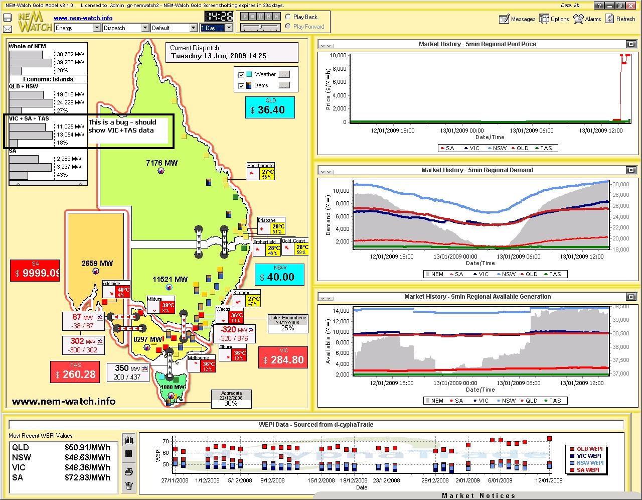
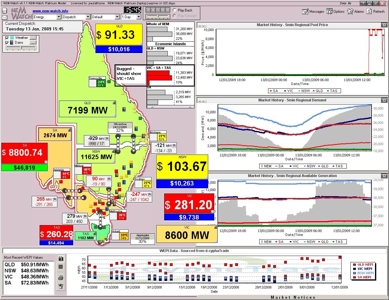
Only 10 minutes later (at 14:25) we see that constraints on the NSW-VIC transmission line and increased transfers to TAS mean that a VIC+TAS Economic Island is created, as shown in the map below. As can be seen, prices in the VIC+TAS Economic Island jump into the hundreds – creating 3 distinct pricing bands across the NEM. Note here that we’ve discovered a bug in the labelling of IRPM for the Economic Island that will be corrected for the major upgrade to version 8.2 See in this instance that the SA Economic Island was still enjoying the relative security of a 42% reserve margin (1,000MW of spare capacity) – meaning we need to look further to understand why pricing was so high at the time (i.e. SA was NOT in danger of running out of capacity because of its high demand). Also, note that this is the first record of temperatures in Adelaide reaching 40 degrees. |
|
|
|
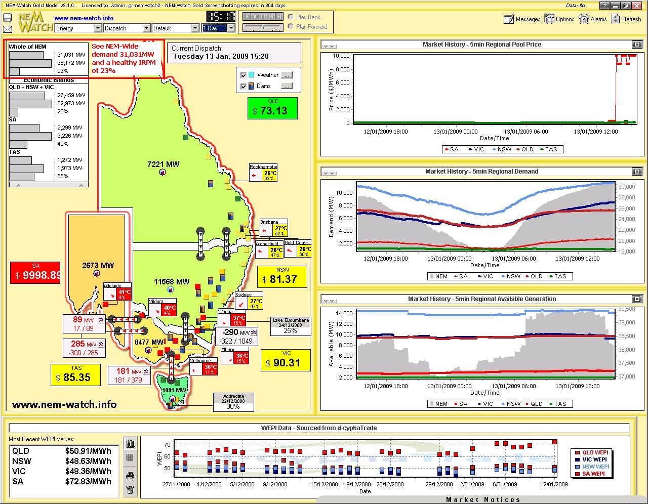
At 15:20 (55 minutes later) we see that prices in SA were still high – however prices in VIC and TAS had subsided as the flow from NSW to VIC had reduced slightly, unbinding the interconnector. We also see, at this time, that NEM-Wide Demand had climbed above 31,000MW (we’ll report on this more later, with respect to our “Who’s the Best Demand Forecaster in the NEM this Summer” Competition). |
|
|
|
At 15:45, we see that flow from NSW to VIC had been further constrained down, resulting in a QLD+NSW and a VIC+TAS Economic Island set again. In conjunction with this, we see prices jump again in VIC+TAS. Prices also climb a little in QLD+NSW (to around $100/MWh) in conjunction with the hot weather reaching up further into NSW. |
|
|
|
Note with respect to the snapshot above (of 15:45) that this also mistakenly shows a calculation for a VIC+SA+TAS island, whereas it should just be VIC+TAS. The display is useful to illustrate, however, how low IRPM Economic Islands will be highlighted in version 8.2. At 16:00, we see that the prices in VIC+TAS had doubled over the 15 minute period (we also see the NEM-Wide demand had grown to 31,250MW). |
|
|
|
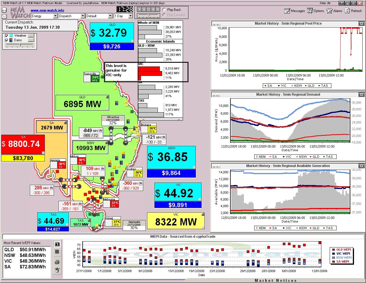
Even as late as 17:30 in the day (below) we see that temperatures remained high, though we see demand starting to subside. Despite this, high prices persist in SA. Also of interest, in this case is the illustration of genuine level of relatively low reserve in the VIC-only Economic Island that existed for this dispatch interval: Also in the illustration below, we can see that the 7-day rolling Cumulative Price for SA had risen significantly to $83,780/MWh – meaning SA was more than half-way to having price caps imposed. Again, this price box is also colour-coded to make it easy for you to see what matters, even at a distance. |
|
|
|
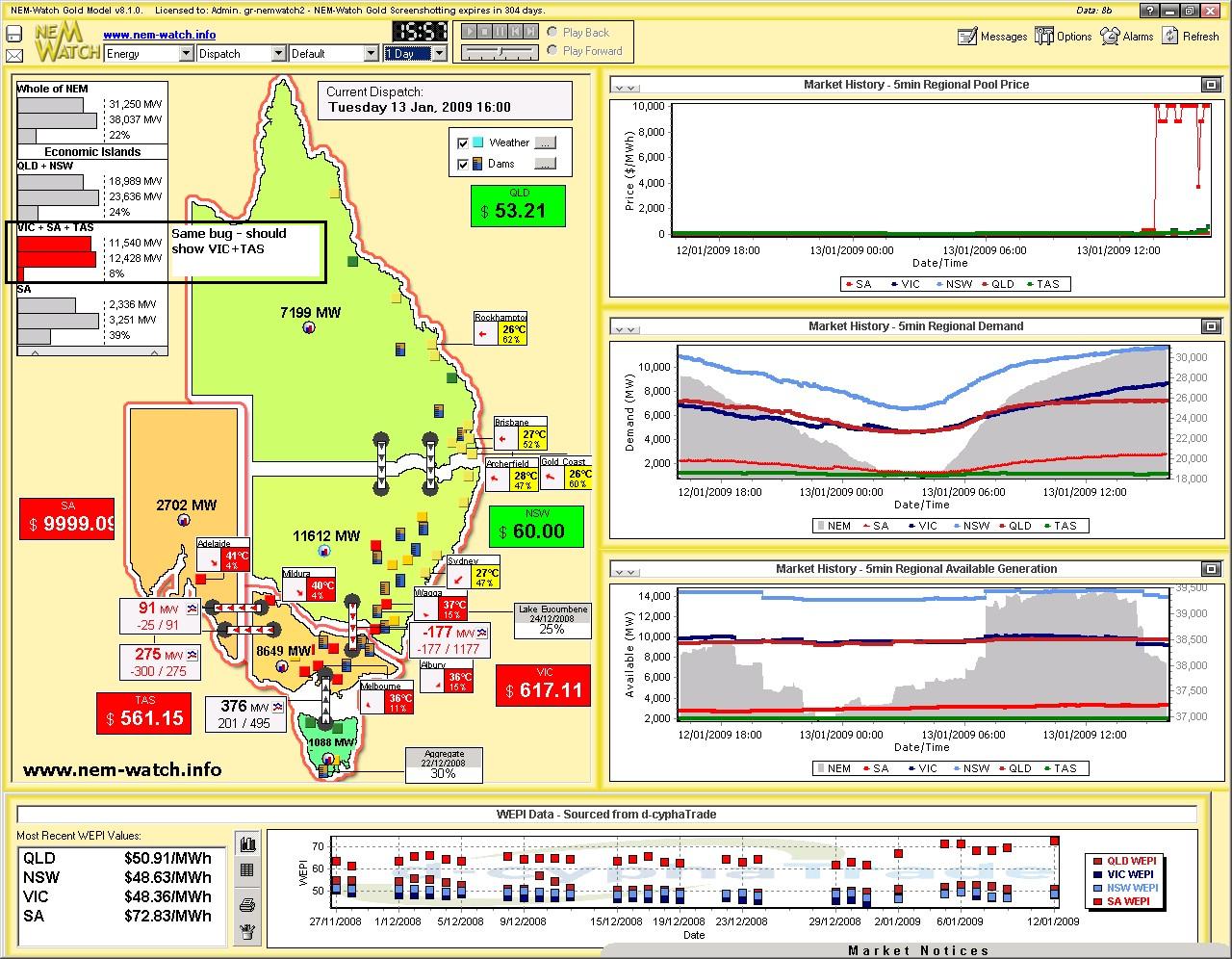
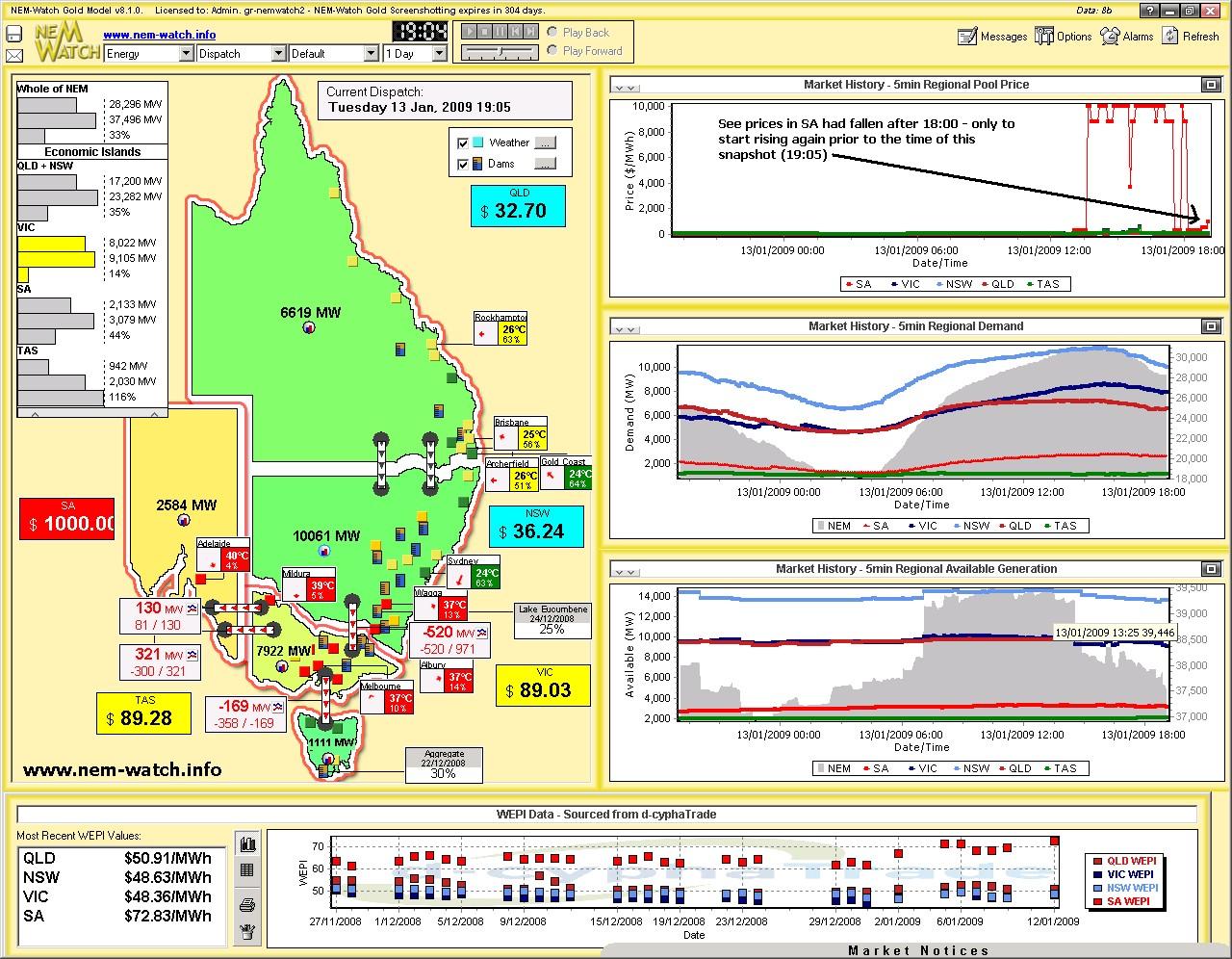
Event at 19:05 (95 minutes later), we see demand was still stubbornly high in SA (because temperatures remained high). We also see from the chart that the prices had fallen over the intervening period – though they jumped again to $1000/MWh for this snapshot. |
|
|
|
Finally, at 20:55 we see that prices in SA had dropped, along with demand (somewhat) as temperatures began to decline. As shown in this snapshot, the 7-day Cumulative Price in SA had risen to $90,408/MWh by this stage. |
|
|
|
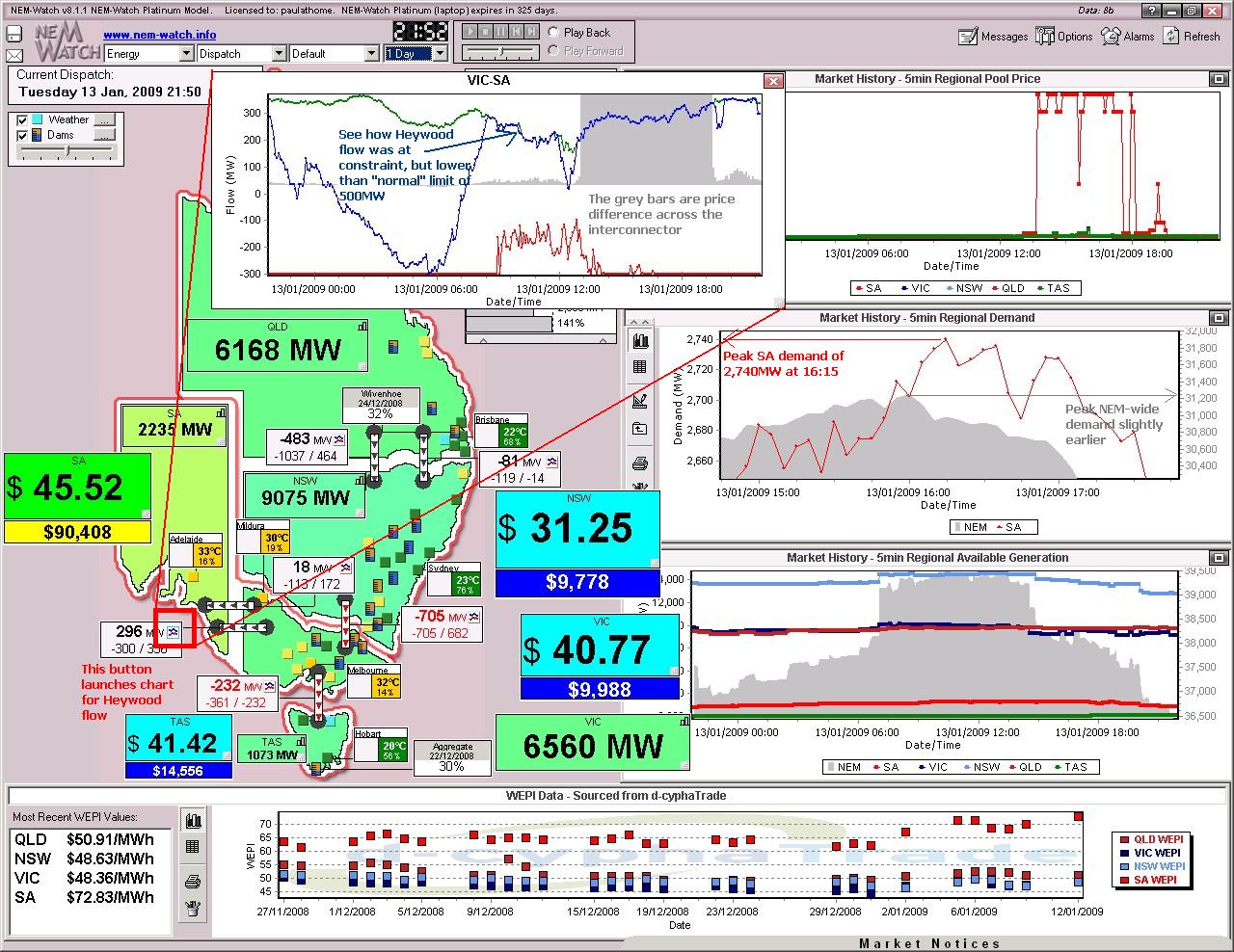
As one final record on the day, we see in this snapshot (from 21:50) that the demand peak in SA had coincided almost exactly with the peak NEM-Wide demand over the day. |
|
|
|
Also shown in this screenshot is a chart highlighting flow over the Heywood interconnector – see how the flow stuck to the constraint limit, but that the constraint limit was approximately half of the “normal” limit of 500MW. |
4) Later Analysis
Following NEMMCO’s release of other generation data (the following morning) we can use the NEM-Review software package to have a look at other aspects of what happened over the day.
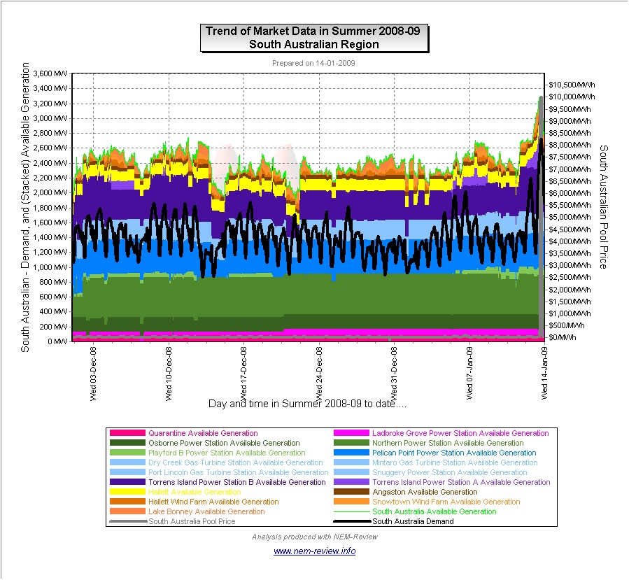
In the first chart (shown above) we can clearly see a number of things, including:
- That the demand in South Australia on the 13th January 2009was substantially higher than had been experienced at any time since summer started on the 1st December 2008;
- That the price spike shown in SA on the 13th January was also the first of summer; and
- That there was considerably more generation capacity offered to the market for the 13th January than at any other day over the summer period, to date. Much of this additional capacity can be seen to be made available at the Torrens station.
Given that the spikes followed from the behaviour that was seen in March 2008, and is currently under investigation by the AER, we thought it might be of interest to include the following charts, highlighting how the output at the major SA generators varied over the day:
(a) Torrens Island
Torrens Island (A and B) is currently owned by AGL Energy.
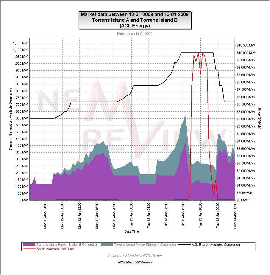
With this cursory glance, it does appear that AGL may have been engaging in behaviour similar to that of last summer.
(b) Pelican Point
Pelican Point is currently owned by Internationalpower.
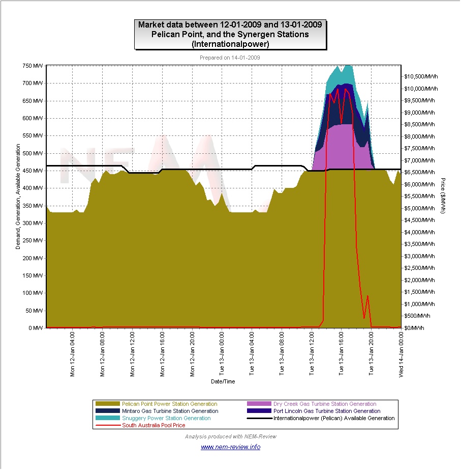
As can be seen, International Power ran Pelican Point “flat out” over the time of the spike. Their (higher cost) peaking plant were called on to operate and make up the additional demand.
(c) Northern & Playford
Northern and Playford and currently owned by Babcock & Brown Power. BBPower also bit the Osborne plant into the market (though they only own the PPA, in this instance).
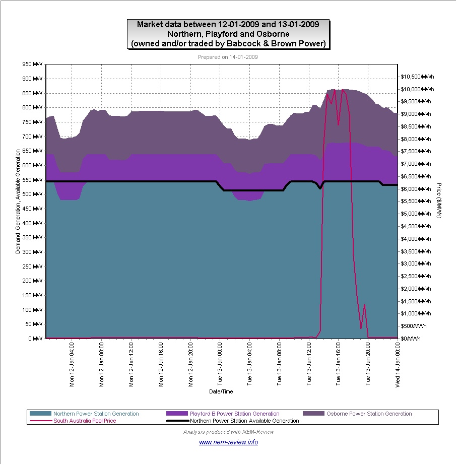
As can be seen, Northern also ran at maximum capability over the time of the price spike – output at Playford and Osborne both increased at the time of the spike in demand.
In relation to the chart shown above with respect to AGL’s Torrens Island plant, this report in the SMH will be of interest.
In his article, Brian Robins makes reference to this investigation at the AER.
Please note our view of a few principles of how an energy-only market should operate.